| Image |
Comment |
| 04/30/2008 06:34:18 AM |
Clockby Kel27Comment by DavidLopez: Strange angle and border. It would have been better is it was sharper. |
| 04/30/2008 04:21:30 AM |
Clockby Kel27Comment by one2one: Tilted to the right. OOF. Kind of small too. Tones are ok. |
| 04/30/2008 12:20:39 AM |
|
| 04/19/2008 08:32:24 AM |
|
| 04/17/2008 04:37:37 AM |
Flowerby Kel27Comment by HaikuSailor: Almost like watercolor, very pretty with an erotic suggestivness and appeal. |
| 04/15/2008 04:59:46 PM |
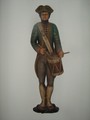
Statueby Kel27Comment by neophyte: I'll admit I gave this a low score. I've never been a fan of photos of artwork (Popular, ordinary or otherwise) that don't use lighting/shadows or POV to add something. The noise detracts too. You do, however meet the theme perfectly. Just one person's opinion. Good luck in the challenge. |
| 04/13/2008 03:44:19 PM |
|
| 04/11/2008 09:16:15 AM |
Statueby Kel27Comment by paynekj: It looks a bit washed-out especially on his left hand shoulder |
| 04/10/2008 06:50:08 AM |
|
| 04/09/2008 04:47:40 PM |
|
Home -
Challenges -
Community -
League -
Photos -
Cameras -
Lenses -
Learn -
Help -
Terms of Use -
Privacy -
Top ^
DPChallenge, and website content and design, Copyright © 2001-2025 Challenging Technologies, LLC.
All digital photo copyrights belong to the photographers and may not be used without permission.
Current Server Time: 04/07/2025 09:21:42 AM EDT.