| Author | Thread |
Comments Made During the Challenge  |
|
|
04/15/2008 04:59:46 PM |
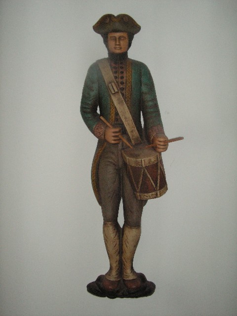
| I'll admit I gave this a low score. I've never been a fan of photos of artwork (Popular, ordinary or otherwise) that don't use lighting/shadows or POV to add something. The noise detracts too. You do, however meet the theme perfectly. Just one person's opinion. Good luck in the challenge. |
|
|
|
04/13/2008 03:44:19 PM |
| It is a centered composition... |
|
|
|
04/11/2008 09:16:15 AM |
| It looks a bit washed-out especially on his left hand shoulder |
|
|
|
04/10/2008 06:50:08 AM |
|
|
|
04/09/2008 04:47:40 PM |
|
|
|
04/09/2008 03:21:26 PM |
| Statue looks a bit hazy on that upper right shoulder. not sure why. |
|
Home -
Challenges -
Community -
League -
Photos -
Cameras -
Lenses -
Learn -
Help -
Terms of Use -
Privacy -
Top ^
DPChallenge, and website content and design, Copyright © 2001-2025 Challenging Technologies, LLC.
All digital photo copyrights belong to the photographers and may not be used without permission.
Current Server Time: 04/07/2025 02:37:18 PM EDT.