| Image |
Comment |
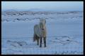
| 04/26/2005 06:21:44 AM |
Hesturby LjonComment by cpanaioti: Good choice of subject. You've got lots of contrast despite the light on light.
The barbed wire fence is a little distracting but sometimes things like that cannot be helped.
The horse seems a little to central. A change in viewpoint either to the left or right would probably improve the composition. |
 Photographer found comment helpful. Photographer found comment helpful. |
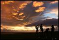
| 04/26/2005 06:19:51 AM |
Color in the skyby LjonComment by cpanaioti: Good use of a low horizon and good composition with your silhouetted subjects in the lower right.
If there was more distinction between the horizon and the sky I think the image would have more impact. Also, a different vantage point may help as well to provide more contrast between the silhouettes and the sky.
|
| Photographer found comment helpful. |
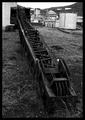
| 04/26/2005 06:17:09 AM |
Kraniby LjonComment by cpanaioti: The crane provides a nice leading line into the image however it is a little on the dark side to be the main subject. More contrast might help. Toning down the white objects in the background would probably help as well.
Light objects always draw the most attention. B/W images are all about contrast and texture. |
| Photographer found comment helpful. |
| 10/20/2004 01:45:21 AM |
Tool Of Universal Communicationby LjonComment by Ljon: Well this being my first challenge entry I would like to thank those who took time to voted for my photo and specially those who gave comments. I hadn´t realised how much I means to get somones opinion on your work. Most of the comments I got were about my photo not being in focus but that's actually what I was going for. I wanted the photos in the back to be in focus. But after getting those comments and looking harder on my entry. . . I don't know what I was thinking! Of course the camera and the whole pic had to be in focus but I'm still learning and I'm sure I'll do it better in next challenge :) |
| 10/19/2004 05:26:39 PM |
|
| Photographer found comment helpful. |
| 10/19/2004 02:51:27 AM |
Tool Of Universal Communicationby LjonComment by alien2thisworld: In line with the challenge, though I wonder if a different (less standard) composition could have given this shot a unique feel. Focus of picture draws to camera lens, which is dead center in the "foul zone" which doesn't leave too much of a natural path for the eye to follow. Using the rule of thirds might give the shot some more energy |
| Photographer found comment helpful. |
| 10/16/2004 05:46:55 AM |
|
| Photographer found comment helpful. |
| 10/15/2004 12:25:23 AM |
|
| Photographer found comment helpful. |
| 10/14/2004 11:45:22 PM |
Tool Of Universal Communicationby LjonComment by Artyste: A little soft on the camer and lens. The sepia works, but I think it's also a tad strong. A diffuser on your flash/lighting would have helped the glare from the lens as well. |
| Photographer found comment helpful. |
| 10/14/2004 08:55:02 PM |
|
| Photographer found comment helpful. |
Home -
Challenges -
Community -
League -
Photos -
Cameras -
Lenses -
Learn -
Help -
Terms of Use -
Privacy -
Top ^
DPChallenge, and website content and design, Copyright © 2001-2025 Challenging Technologies, LLC.
All digital photo copyrights belong to the photographers and may not be used without permission.
Current Server Time: 04/09/2025 01:06:35 PM EDT.