| Image |
Comment |
| 07/31/2008 08:06:35 PM |
|
 Photographer found comment helpful. Photographer found comment helpful. |
| 07/29/2008 01:44:50 PM |
Fruit Punchby battymaddieComment by ambaker: Critique Club Review:
Color Saturation and Hue: Colors appear a little washed out, and could use a little more saturation. Hues appear realistic.
Brightness and contrast: A little less bright, and a little more contrast here would help this image pop.
Focus and depth of field: Focus is OK. Depth of field comes across as a bit shallow, at the top of the head where the details go soft.
Pointandshoot has done most of my work for me already. Your re-edited image pops a lot better. I think you could still take if further though. The drink just begs to be a nice ruby red. With the white background, the rest of the image needs to be sharp and saturated. A different background with some soft detail like a blue sky with some soft clouds could have worked well also.
I'm a little surprised that this image did not score better. Even at thumbnail size it is an attention getter, and has nice bones to build upon. |
| Photographer found comment helpful. |
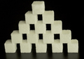
| 07/27/2008 07:30:55 PM |
Sugar Pyramidby battymaddieComment by GeneralE: I like your construction; on my monitor the sugar looks a little off-white -- I'd have tried to adjust that a bit. |
| Photographer found comment helpful. |
| 07/24/2008 09:46:01 AM |
Fruit Punch Editedby battymaddieComment by wehrmacher: Hi. I loved, and still love, this picture, but did not manage voting on this challenge. Had I voted, it would have been in the 7 or 8 range, limited only by not seeing how it might include a receipt. I am not sure that I like this version much better than the original, although it is certainly not worse. The expression on the model's lovely face is so engaging, that all else sort of fades into minutia.
Great job... in both versions. |
| Photographer found comment helpful. |
| 07/23/2008 02:46:15 PM |
|
| Photographer found comment helpful. |
| 07/23/2008 02:40:17 PM |
|
| Photographer found comment helpful. |
| 07/23/2008 08:51:40 AM |
|
| Photographer found comment helpful. |
| 07/22/2008 09:53:32 PM |
Fruit Punchby battymaddieComment by pointandshoot: The color combinations and model's expression are wonderful.
Maybe, someday, all browsers will correctly interpret an Adobe RGB profile. Until then, if you have your working color space set to "Adobe RGB" in PS make sure to "convert to profile" sRGB before you "Save for Web". Otherwise, your colors will not appear as vibrant (they will look washed out) compared to when you were viewing/editing the photo in PS. So, until browsers get smarter, don't embed an "Adobe RGB" profile on a photo you put on the web.
Also, this could use some additional sharpening. Try Smart Sharpen at about 300% and .3 pixel radius and see what you think.
As it is, this shot was under-rated. Good job! |
| Photographer found comment helpful. |
| 07/22/2008 05:52:55 PM |
|
| Photographer found comment helpful. |
| 07/19/2008 08:07:22 AM |
|
| Photographer found comment helpful. |
Home -
Challenges -
Community -
League -
Photos -
Cameras -
Lenses -
Learn -
Help -
Terms of Use -
Privacy -
Top ^
DPChallenge, and website content and design, Copyright © 2001-2025 Challenging Technologies, LLC.
All digital photo copyrights belong to the photographers and may not be used without permission.
Current Server Time: 04/08/2025 12:40:58 AM EDT.