| Author | Thread |
|
|
07/29/2008 01:44:50 PM |
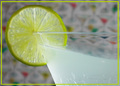
Critique Club Review:
Color Saturation and Hue: Colors appear a little washed out, and could use a little more saturation. Hues appear realistic.
Brightness and contrast: A little less bright, and a little more contrast here would help this image pop.
Focus and depth of field: Focus is OK. Depth of field comes across as a bit shallow, at the top of the head where the details go soft.
Pointandshoot has done most of my work for me already. Your re-edited image pops a lot better. I think you could still take if further though. The drink just begs to be a nice ruby red. With the white background, the rest of the image needs to be sharp and saturated. A different background with some soft detail like a blue sky with some soft clouds could have worked well also.
I'm a little surprised that this image did not score better. Even at thumbnail size it is an attention getter, and has nice bones to build upon. |
|
 Photographer found comment helpful. Photographer found comment helpful. |
|
|
07/22/2008 09:53:32 PM |
The color combinations and model's expression are wonderful.
Maybe, someday, all browsers will correctly interpret an Adobe RGB profile. Until then, if you have your working color space set to "Adobe RGB" in PS make sure to "convert to profile" sRGB before you "Save for Web". Otherwise, your colors will not appear as vibrant (they will look washed out) compared to when you were viewing/editing the photo in PS. So, until browsers get smarter, don't embed an "Adobe RGB" profile on a photo you put on the web.
Also, this could use some additional sharpening. Try Smart Sharpen at about 300% and .3 pixel radius and see what you think.
As it is, this shot was under-rated. Good job! |
|
| Photographer found comment helpful. |
Comments Made During the Challenge  |
|
|
07/19/2008 08:07:22 AM |
| Good shot actually, but the lack of contrast and the flat colors makes it look like a scan of a magazine ad circa 1972. |
|
| Photographer found comment helpful. |
|
|
07/18/2008 08:14:12 PM |
| great expression lol. this image would have been awesome just a tid bit sharper. |
|
| Photographer found comment helpful. |
|
|
07/18/2008 07:06:43 AM |
|
| Photographer found comment helpful. |
|
|
07/17/2008 08:45:46 PM |
| Fun shot and great model. Just missing a bit of contrast I think. |
|
| Photographer found comment helpful. |
|
|
07/17/2008 05:12:09 PM |
| There is a yellow hue to this photo... |
|
| Photographer found comment helpful. |
|
|
07/17/2008 11:37:50 AM |
| nice model, but maybe a higher angle would have helped wit the lighting of her face and overall color richness...actualy i have no idea what im talking about, so just ignore me |
|
| Photographer found comment helpful. |
|
|
07/17/2008 12:14:54 AM |
| The hot spot on the front of the glass kinda bothers me |
|
| Photographer found comment helpful. |
|
|
07/16/2008 03:14:57 PM |
|
| Photographer found comment helpful. |
Home -
Challenges -
Community -
League -
Photos -
Cameras -
Lenses -
Learn -
Help -
Terms of Use -
Privacy -
Top ^
DPChallenge, and website content and design, Copyright © 2001-2025 Challenging Technologies, LLC.
All digital photo copyrights belong to the photographers and may not be used without permission.
Current Server Time: 04/07/2025 01:31:58 AM EDT.