| Image |
Comment |
| 05/25/2003 07:31:45 PM |
|
 Photographer found comment helpful. Photographer found comment helpful. |
| 05/25/2003 10:11:29 AM |
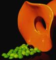
Secondary Colorsby ploogieaComment by HBunch: *Critique Club*
I like the colors, but think that the Skittles are a little tacky. The round dish is elegant looking and the skittles are kind of kiddy looking.
I do like the lighting. There are no glares or distracting shadows anywhere, which is good considering you were photographing some shiny objects. I wonder though, if maybe there could be a little more light on the skittles. They seem darker than the object.
It looks really nice with the background as well. Bright objects on dark background. Nothing distracting there at all.
There is a dark blob in the middle of the skittles, which I don't find adds anything at all to the shot. I'm not sure what it is, or why it's there. As is, I find it a bit of a distraction.
I like the angle you chose to shoot this at, and the framing you also chose. I like how the flowing top of the orange object is in the right of the photo.
Overall, I really like it. I only think it would look better with maybe some green jems rather than skittles.
~Heather~ |
| Photographer found comment helpful. |
| 05/25/2003 07:05:40 AM |
|
| Photographer found comment helpful. |
| 05/22/2003 03:43:02 PM |
Pastel complimentsby ploogieaComment by qachyk: Huh. Most of the non-intense coloured photographs so far have left me feeling like they missed the topic, but this one works somewhat better for some reason. The pink stands out very well against the pale yellow-to-green, which suggests you've hit the proper colour contrast. Very well done. |
| Photographer found comment helpful. |
| 05/21/2003 12:17:40 PM |
Early Primary Colorsby ploogieaComment by Paige: Critique Club
Hi there, nice representation of the challenge.
Composition is very good with the placement of the slide in the background, I am thinking getting in a little closer might have improved the composition by getting rid of some distracting elements.
Color
There is something off, looks a bit too pink/purple(esp. in the bark), did you change the colors/saturation? or does your camera give you this type of cast?
cropping and rotating a couple of pixels CCW would help with the tilt.
Good title, suits the image well.
Good luck with future challenges!
Paige |
| Photographer found comment helpful. |
| 05/20/2003 08:00:35 PM |
Secondary Colorsby ploogieaComment by dsidwell: INteresting arrangement and objects. And colors for that matter. A bit otherworldly. I wish the candies were more in focus. |
| Photographer found comment helpful. |
| 05/20/2003 01:48:42 PM |
Pastel complimentsby ploogieaComment by ursula: Beatiful picture. I'm not entirely sure about the complementaries, they are quite subdued. But the picture is very nice. |
| Photographer found comment helpful. |
| 05/20/2003 06:13:07 AM |
|
| Photographer found comment helpful. |
| 05/19/2003 02:49:14 PM |
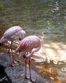
Pastel complimentsby ploogieaComment by Gordon: not sure I really see complimentary colours as usually understood in this shot. Good composition and interesting symmetry in the birds though.. |
| Photographer found comment helpful. |
| 05/19/2003 11:12:10 AM |
|
| Photographer found comment helpful. |
Home -
Challenges -
Community -
League -
Photos -
Cameras -
Lenses -
Learn -
Help -
Terms of Use -
Privacy -
Top ^
DPChallenge, and website content and design, Copyright © 2001-2025 Challenging Technologies, LLC.
All digital photo copyrights belong to the photographers and may not be used without permission.
Current Server Time: 04/06/2025 11:28:07 PM EDT.