Guns & Ammoby
JB707Comment by autool: Critique Club Critique
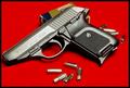
Title: Guns & Ammo, by JB707
Composition: I am one of those that thought entries should have been in portrait, but I admit that pictures in landscape are used for covers also. I think yours is cropped a little close , especially on the left side. Also the ammo box looks just a tad worn, this shows on the flap on the left side. Other than that it is a very good composition.
Technical: This being a difficult subject you have done a commendable job. I see only a couple of things that distract from its quality. The bullets appear to be out of focus and the gun is a tad bright along the slide. I think they (Guns & Ammo) would have toned it down some to make the name stand out more, after all sales are what keeps magazines going.
Challenge: You have met the challenge with this one, but I am confident that it scored lower than it might have if it were in portrait.
Suggestions: I have noticed that most gun related magazines also show the results of the topic gun. Such as targets with a close group or something like that. You might have considered including this type of prop to boost the story line of your photo. You have done a nice job on this photo, so as you say "Keep Shootin."
Disclaimer:
Bear in mind that I am here to learn, just as many others and any comments that I have made are not intended to be offensive in any way, and are only constructive criticisms. If you wish to comment or discuss this critique please feel free to do so at any time.
Thank you,
Dick Pattee (Autool)
Autool@attbi.com