| Image |
Comment |
| 10/31/2006 12:27:24 AM |
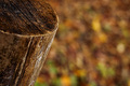
The Last Breathby RossFComment by DIVIAN: yup, a nice one, a bit oversharpened, maybe, still a great shot!! facing the blurry future..nice 1!! |
| 10/29/2006 07:57:10 PM |
|
| 10/28/2006 07:52:39 PM |
|
| 10/28/2006 05:34:08 PM |
|
| 10/25/2006 06:46:33 AM |
The Last Breathby RossFComment by Jutilda: As boring as a stump is, this is one of the better bokeh shots in my opnion. It has a tack sharp focuson the subject and the blurred splotches of color in the background, are appealing and help aid in the appeal of the shot. 7 |
| 09/17/2006 05:42:40 AM |
The Bean Stalkerby RossFComment by Ecce_Signum: Thoughts from Ecce, with his critique club hat on
Firstly congratulations on submitting your first photo at dpc Ross :) This picture doesnt quite work for me for several reasons, I think you overworked the image to get the bg a pure white and (as was mentioned in an earlier comment) it makes the image look as if it was cut out and placed on a white background. For me the card adds nothing to this shot and I wonder if you were just adding 'pastel' colours to the image. I'm sure you could have found a better composition for this shot as although you took the time to seperate the beans they look badly angled. I took the liberty of downloading the image and played with rotations and crops (tight on just the beans and blade) and, imho you'd get a much better effect.
I like a good title and think it finishes of an image and sometimes helps the viewer understand more about the image. I will never vote down an image because of its title or lack one but will sometimes add a point if its spot on with the image and isn't used to shoehorn an image into a competition theme - I loved yours Ross :)
I think its a clever idea but with imperfections in composition and post processing and, after looking through your site I think you'd agree its not amongst your best work? You have some great pictures there and if you submit work like that your first ribbon is around the corner!
Andi
|
| 09/11/2006 06:26:36 AM |
The Bean Stalkerby RossFComment by justamistere: Maybe to make it more realistic, the knife could have been straightened up, to a more vertical position by putting it into some white foam or a small hidden C-clamp. That would hold it in a natural cutting angle. The paper detracts. Great title.
I'd like to see a retake with a dramatic, suspensfull, black background and beans made more pastel. Then you would have to add a small spotlight on the knife, if you wanted the handle to show. Pastel would bring out the blood and knife more. |
| 09/10/2006 04:24:39 PM |
|
| 09/10/2006 12:14:20 PM |
|
| 09/10/2006 06:17:25 AM |
|
Home -
Challenges -
Community -
League -
Photos -
Cameras -
Lenses -
Learn -
Help -
Terms of Use -
Privacy -
Top ^
DPChallenge, and website content and design, Copyright © 2001-2025 Challenging Technologies, LLC.
All digital photo copyrights belong to the photographers and may not be used without permission.
Current Server Time: 04/09/2025 03:51:43 PM EDT.