| Author | Thread |
|
|
09/17/2006 05:42:40 AM |
Thoughts from Ecce, with his critique club hat on
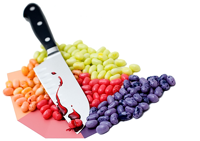
Firstly congratulations on submitting your first photo at dpc Ross :) This picture doesnt quite work for me for several reasons, I think you overworked the image to get the bg a pure white and (as was mentioned in an earlier comment) it makes the image look as if it was cut out and placed on a white background. For me the card adds nothing to this shot and I wonder if you were just adding 'pastel' colours to the image. I'm sure you could have found a better composition for this shot as although you took the time to seperate the beans they look badly angled. I took the liberty of downloading the image and played with rotations and crops (tight on just the beans and blade) and, imho you'd get a much better effect.
I like a good title and think it finishes of an image and sometimes helps the viewer understand more about the image. I will never vote down an image because of its title or lack one but will sometimes add a point if its spot on with the image and isn't used to shoehorn an image into a competition theme - I loved yours Ross :)
I think its a clever idea but with imperfections in composition and post processing and, after looking through your site I think you'd agree its not amongst your best work? You have some great pictures there and if you submit work like that your first ribbon is around the corner!
Andi
|
|
|
|
09/11/2006 06:26:36 AM |
Maybe to make it more realistic, the knife could have been straightened up, to a more vertical position by putting it into some white foam or a small hidden C-clamp. That would hold it in a natural cutting angle. The paper detracts. Great title.
I'd like to see a retake with a dramatic, suspensfull, black background and beans made more pastel. Then you would have to add a small spotlight on the knife, if you wanted the handle to show. Pastel would bring out the blood and knife more. |
|
Comments Made During the Challenge  |
|
|
09/10/2006 04:24:39 PM |
|
|
|
09/10/2006 12:14:20 PM |
| The red distracts from the pastel hue. |
|
|
|
09/10/2006 06:17:25 AM |
| A little morbid for my taste. :) 6 |
|
|
|
09/09/2006 09:01:47 PM |
| Clever and well done, but colors a bit strong for pastel. |
|
|
|
09/09/2006 04:08:35 AM |
| I like your idea but feel like the subject is floating or has been cut out and placed on a white backing. |
|
|
|
09/08/2006 06:45:29 PM |
| great colors, not a fan of the paper the beans are laying on |
|
|
|
09/08/2006 05:44:27 AM |
| Nice title. At first I was wondering what is with the knife, Then I read the Title and all came together. Nice idea. |
|
|
|
09/06/2006 06:48:05 PM |
| great photo, too much editing |
|
|
|
09/05/2006 10:50:45 PM |
|
|
|
09/05/2006 04:42:21 PM |
| Excellent idea and execution! |
|
|
|
09/05/2006 02:18:30 PM |
|
|
|
09/05/2006 07:35:13 AM |
| Excellent composition and colors! The punny title is cute too ;) Good luck in the challenge. Now I want some jelly bellies! |
|
|
|
09/05/2006 02:25:53 AM |
|
|
|
09/04/2006 10:03:25 PM |
| Nice lighting and a clever idea executed (hehe no pun there right?) well. Like the DOF you chose to shoot at as well. This is really a spot on shot that needs no improvement IMHO. Well done, 10 from this voter. |
|
|
|
09/04/2006 05:43:54 PM |
| Cute setup!! Nice clear image. |
|
|
|
09/04/2006 05:00:43 PM |
| gross but clever!! i like it! i would have a tighter crop on the left |
|
|
|
09/04/2006 05:14:52 AM |
| interesting take. Poor jelly belly! |
|
|
|
09/04/2006 03:18:41 AM |
| great idea and well taken, my only point would be the large expanse of white in the upper right part of the shot |
|
|
|
09/03/2006 08:34:23 PM |
| clever shot...very creative and a good final result...well done |
|
Home -
Challenges -
Community -
League -
Photos -
Cameras -
Lenses -
Learn -
Help -
Terms of Use -
Privacy -
Top ^
DPChallenge, and website content and design, Copyright © 2001-2025 Challenging Technologies, LLC.
All digital photo copyrights belong to the photographers and may not be used without permission.
Current Server Time: 04/07/2025 01:04:28 AM EDT.