| Image |
Comment |
| 02/22/2006 06:24:50 AM |
|
| 02/22/2006 05:25:38 AM |
Manhatton view of New York City.by jayitaComment by persimon: Image lacks contrast. I like the duotone you used, but I think it makes it difficult to really contrast when you have lots of details. I like the subject matter, and the composition is great. |
| 02/22/2006 04:30:44 AM |
|
| 02/21/2006 03:57:16 PM |
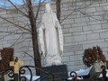
Motherby jayitaComment by f-32: I'm sure lots of people will express concern about your horizon's level of horizontalness. . . . |
| 02/21/2006 03:57:03 PM |
|
| 02/21/2006 06:27:26 AM |
|
| 02/21/2006 03:16:10 AM |
Motherby jayitaComment by elinias: This composition isn't doing it for me, sorry, it's leaning too much. |
| 02/20/2006 07:35:29 AM |
Motherby jayitaComment by cresus: Not sure if this was purposefully out of level, but it's very distracting. |
| 02/19/2006 02:59:23 PM |
|
| 02/19/2006 11:34:09 AM |
Motherby jayitaComment by Nullix: Why is she leaning to the left? The lean is a bit distracting to me. I hope you did that on purpose. |
Home -
Challenges -
Community -
League -
Photos -
Cameras -
Lenses -
Learn -
Help -
Terms of Use -
Privacy -
Top ^
DPChallenge, and website content and design, Copyright © 2001-2025 Challenging Technologies, LLC.
All digital photo copyrights belong to the photographers and may not be used without permission.
Current Server Time: 04/07/2025 11:48:06 AM EDT.