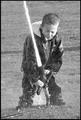
DPChallenge: A Digital Photography Contest You are not logged in. (log in or register
 
Browse Settings
Currently viewing:
Registered Userhowza

Show comments:

Per page:

Order:

Comments:


Comments Received by howza
Pages:   ... ...
Showing 81 - 90 of ~190
Image Comment
    FRUSTRATION
03/23/2003 08:00:28 PM
FRUSTRATION
by howza

Comment by sunflower:
Good black and white, lighting & focus.
The Crossing
01/26/2003 06:21:28 PM
The Crossing
by howza

Comment by Wheeler1992:
a little to much for me in this picture. I like the shopping cart though
The Crossing
01/26/2003 04:00:12 PM
The Crossing
by howza

Comment by jgillard:
This image is a little dark. The problem with this image is that you oversharpened it wayyyy too much. The shot no longer looks natural. I recommend that you do a search for a tutorial on how to use an unsharp mask correctly! I like your composition though. jgillard4
The Crossing
01/24/2003 07:26:17 PM
The Crossing
by howza

Comment by dodobird:
Interestin gchice for a location, it sure is not scenic. I just love the shopping cart in the mud puddle, for som ereason I find it funny. The placement of the objects sign & cart is superb. The focus is sharp, the lighting a tad dark, could stand to be a bit lighter. Subject matter, OK, but not a shot I would want to hang on my walls. 7.
Photographer found comment helpful.
The Crossing
01/24/2003 03:21:15 PM
The Crossing
by howza

Comment by Bullwinkle:
Great urban comment. The shopping cart in the puddle steals the show. I also like the brick wall texture and the freezer rust. Box shapes throughout the image pull the whole show together. Well done.
Photographer found comment helpful.
SNOWFIELD
01/24/2003 01:39:13 PM
SNOWFIELD
by howza

Comment by timj351:
I selected this photo for the Critique Club although I already commented on it. I will try to expound on it further. As you can see from my comments I really like this photo but there were a few things that I would have changed. The bit of grass under the fence is distracting in part because it is so dark and doesn't show a lot of detail. However I do like the taller, thinner grass and maybe would like to see more of that. I would have really tried to keep this scene as simple as possible by showing only the fence and the beautiful snow mounds. I do like the gate and would maybe like to see that emphasised a little more. A slightly different composition may have been even more interesting such as getting even lower to to the ground so that the closest mound looked even bigger and helped to exaggerate the perspective. I wish I were there to study this location it looks really interesting. I would have taken every possible angle and composition I could think of. But as it is it is still very good. You did a nice job with the exposure and colors and it is as sharp as it needs to be. Good job.

Tim
Critique Club
Photographer found comment helpful.
'ONE FOOT IN THE GRAVE'
01/24/2003 12:44:05 PM
'ONE FOOT IN THE GRAVE'
by howza

Comment by DougPaz:
Greetings from the Critique Club };-)

Initial thoughts
Very good composition, meets the challenge, great crispness

Composition/ Content

This shot is incredibly crisp and in focus. I would like to know what kind of lens you used to get in this close. Colors are great and the DOF to blur the background is perfect.

Background
As noted, blurred nicely.

Camera Work - Technical
I like what seems to be late afternoon lighting from the right side. Although I generally don't like centered shots this one is right on. I think you did a good job of cropping the pipe at the bottom too.

Digital Processing - Technical
The only thing I would add here is that I think a 5-6 pixel black border may have made the crispness and vibrant colors stand out even more.

Fits The Challenge
Ahhhhh, here is why you may not have won a ribbon this week. Although technically one of the very best shots, the humor aspect was a bit suspect. The title certainly helped but the shot itself was actually a bit sad.

My Opinion On The Photo
I originally scored this shot a six. Any other week I would have scored it much higher, but I like a lot of others apparently were scoring more on humor and less on technical this week. Really nice shot, and keep up the good work.


I would be happy to talk further about this shot if you would like to contact me.
DougPaz
Photographer found comment helpful.
The Crossing
01/24/2003 08:58:24 AM
The Crossing
by howza

Comment by LobsterClaws:
a bit too sharpened the shopping cart looks unnaturally edgy.
The Crossing
01/23/2003 04:21:16 AM
The Crossing
by howza

Comment by kiwiness:
This is a messy neighbourhood. I had to laugh at that shopping trolley sticking out of the ground there. I feel the signs are a little out of focus, but otherwise good job.
The Crossing
01/22/2003 06:44:17 PM
The Crossing
by howza

Comment by Silver Fox:
Wow! Talk about a message! Like the color of the rust showing on the box, the red and white stripes on the signs, the red brick wall with the white graffiti. Nicely done!
Pages:   ... ...
Showing 81 - 90 of ~190


Home - Challenges - Community - League - Photos - Cameras - Lenses - Learn - Help - Terms of Use - Privacy - Top ^
DPChallenge, and website content and design, Copyright © 2001-2025 Challenging Technologies, LLC.
All digital photo copyrights belong to the photographers and may not be used without permission.
Current Server Time: 04/09/2025 01:07:15 PM EDT.