Splash of Colourby
SteveZComment by photom: Hi Steve and
Greetings from the Critique Club
You found an expecially nice scene for
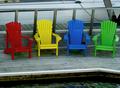
Splash of Color.
The four colors are well saturated in what appears to be a really overcast day. The gray boards of the dock really make the chairs pop right out. But even so - I think there may be a slight under exposure problem because the boat behind the chairs should probably be white instead of the gray it appears to be. But then again, if the boat were exposed "correctly" you would lose the great saturation of colors in the chairs.
Some other commenters left remarks that they thought the diagonal lines behind the chairs - the rope and the post were a bit distracting. I agree - the focus of the image needs to stay on the wondeful chairs - anything that draws attention away from them is unfortunate.
Perhaps you could have moved to the right and shot at a different angle to eliminate the diagonals. I can't tell what freedom you had to maneuver - but it also would work really well if you could have gotten quite a bit higher and shot more at a down angle.
As suggested you may also want to try cropping the image so that it is a long, narrow horizontal - removing the water and white edge of the dock in front and everything above the railing in back.
You really nailed the focus - the image is sharp as a tack - which adds a lot of overall impact.
I suspect the reason it did not score higher was the fact you entered it in the "extraordinary" challenge. That one had loads of top-noth entries - and the voters were really wanting to be wowed.
In any event - you obviously have a good eye and excellent technical skills. So - get out, shoot and keep on entering!