| Author | Thread |
|
|
07/13/2004 04:57:11 PM |
Hi Steve and Greetings from the Critique Club
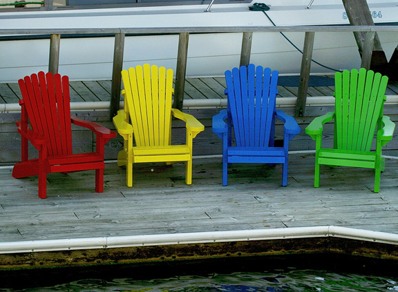
You found an expecially nice scene for Splash of Color.
The four colors are well saturated in what appears to be a really overcast day. The gray boards of the dock really make the chairs pop right out. But even so - I think there may be a slight under exposure problem because the boat behind the chairs should probably be white instead of the gray it appears to be. But then again, if the boat were exposed "correctly" you would lose the great saturation of colors in the chairs.
Some other commenters left remarks that they thought the diagonal lines behind the chairs - the rope and the post were a bit distracting. I agree - the focus of the image needs to stay on the wondeful chairs - anything that draws attention away from them is unfortunate.
Perhaps you could have moved to the right and shot at a different angle to eliminate the diagonals. I can't tell what freedom you had to maneuver - but it also would work really well if you could have gotten quite a bit higher and shot more at a down angle.
As suggested you may also want to try cropping the image so that it is a long, narrow horizontal - removing the water and white edge of the dock in front and everything above the railing in back.
You really nailed the focus - the image is sharp as a tack - which adds a lot of overall impact.
I suspect the reason it did not score higher was the fact you entered it in the "extraordinary" challenge. That one had loads of top-noth entries - and the voters were really wanting to be wowed.
In any event - you obviously have a good eye and excellent technical skills. So - get out, shoot and keep on entering! |
|
Comments Made During the Challenge  |
|
|
07/04/2004 10:24:19 AM |
| great use of color (if only you could do advanced editing to remove some of the background stuff). I think the water and pool edge could be cropped making this a more linear shot. |
|
|
|
07/02/2004 12:56:24 PM |
| I like this photo....it is simple, but speaks to me. This photo makes me want to sit in each and every color!! |
|
|
|
07/01/2004 01:59:57 AM |
|
|
|
07/01/2004 01:01:04 AM |
| Great subject and love the colors. I just don't like the perspective much. It would have much more impact if you pretended that the chairs were people and try to get level with them. Or even lower to give it an abstract perspective. Great overall photo! |
|
|
|
06/30/2004 06:35:17 PM |
| Desat reject? Interesting. |
|
|
|
06/30/2004 03:54:32 PM |
| Very nice. Better cropping is needed. The edge of the deck and the water detract from the graphic quality of the composition. I'm not sure this is extraordinary. |
|
|
|
06/30/2004 07:53:11 AM |
| i'm not sure this fits the challenge in my opinion. an interesting photo none the less with great colors |
|
|
|
06/30/2004 05:15:45 AM |
| Background detracts, especially the rope tied to the cleat on the side of the boat. I love the colors of the chairs, wish they were centered, and was just them on the dock. |
|
Home -
Challenges -
Community -
League -
Photos -
Cameras -
Lenses -
Learn -
Help -
Terms of Use -
Privacy -
Top ^
DPChallenge, and website content and design, Copyright © 2001-2026 Challenging Technologies, LLC.
All digital photo copyrights belong to the photographers and may not be used without permission.
Current Server Time: 02/01/2026 12:06:47 PM EST.