DPChallenge: A Digital Photography Contest You are not logged in. (log in or register
 
Browse Settings
Currently viewing:
Registered Userzenelf

Show comments:

Per page:

Order:

Comments:


Comments Received by zenelf
Pages:   ...
Showing 1 - 10 of ~154
Image Comment
skunked
01/12/2009 02:27:27 PM
skunked
by zenelf

Comment by katswig:
Needs better focus onthe pegs.
skunked
01/09/2009 02:53:48 PM
skunked
by zenelf

Comment by Adamsw216:
Unfortunately, I'm not familiar with this game...
skunked
01/08/2009 05:09:56 PM
skunked
by zenelf

Comment by FireBird:
I'm caused to wonder if WhiteRook has taken up a different hobby....
skunked
01/07/2009 05:48:17 AM
skunked
by zenelf

Comment by treimee:
I am guessing you used a Lens Baby?
My son is green lantern
06/13/2006 01:40:29 AM
My son is green lantern
by zenelf

Comment by Zoomdak:
Zoom on the lens? Draws you into that one point, but what is so important about that point?
Photographer found comment helpful.
My son is green lantern
06/07/2006 08:14:32 PM
My son is green lantern
by zenelf

Comment by sherpet:
Too much movement.....
Photographer found comment helpful.
Body
06/07/2006 05:10:58 PM
Body
by zenelf

Comment by nards656:
==Greetings from the Critique Club==

Composition
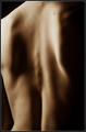
My eye wanders a lot as I study this shot. There are really no leading lines, and there are no points that I can easily focus on. The shadows are dominant and the crop seems a little bit off. I wish I could offer more constructive advice here, but I'm not sure of what I would do to improve this particular composition.

Camera Technicals
The histogram is probably acceptable, but the harsh lighting makes this a higher contrast picture than I think would work best. Softer lighting would have made this a more "sensual" image, I believe.

Post Processing
Here again, the overall result seems a little more harsh than optimal.

Challenge
You've very clearly met the challenge description. I doubt there was much question about that, as the use of shadows emphasize it.

Overall Impression
To me, this is a confusing image to look at, and the subject is hard to define. However, as a bit of an abstract, it is well done and technically good. It creates more questions than it answers, and it leaves me questioning what the photographer is attempting to communicate. I did not vote in this challenge, but probably would have given this a 6 or 7.

I hope you find these thoughts to be helpful and constructive. Keep up the good work! This is a good score.
My son is green lantern
06/07/2006 01:54:44 PM
Body
06/06/2006 04:18:42 PM
Body
by zenelf

Comment by GT350:
Nice use of light and shadow. The angle the light is coming in really shows the textures. I like the full frame as well.
Photographer found comment helpful.
Body
06/02/2006 03:50:27 PM
Body
by zenelf

Comment by br o kenl o ve:
It's a good concept...so many people do it. Overall, the shadows work very well for me, but I think that maybe the cropping could've been a little different?
Photographer found comment helpful.
Pages:   ...
Showing 1 - 10 of ~154


Home - Challenges - Community - League - Photos - Cameras - Lenses - Learn - Help - Terms of Use - Privacy - Top ^
DPChallenge, and website content and design, Copyright © 2001-2025 Challenging Technologies, LLC.
All digital photo copyrights belong to the photographers and may not be used without permission.
Current Server Time: 04/07/2025 07:16:32 AM EDT.