| Image |
Comment |
| 05/17/2004 07:26:36 PM |
|
| 05/16/2004 10:08:54 AM |
|
| 05/16/2004 04:28:29 AM |
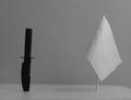
Deadly Oppositesby rigelComment by Glen King: I know the background contrast brings out the message of your photo, but I think I'd like a little more differentation between background and foreground would help. |
| 05/16/2004 03:39:21 AM |
Deadly Oppositesby rigelComment by Count: Cool idea for a picture, I like the idea alot. I think you'll get burned a bit for the noise, looks like you took the picture in very very low lighting. Nice job though... |
| 05/15/2004 04:20:16 PM |
Deadly Oppositesby rigelComment by hannafate: Blurry and plain. You could have made this more dynamic by putting the items a little closer together, and using more directional light. |
| 05/15/2004 09:14:48 AM |
|
| 05/15/2004 08:13:38 AM |
|
| 05/14/2004 12:39:42 PM |
Deadly Oppositesby rigelComment by sadrzy: Black vs. white and war vs. peace - contrasting tones and symbols working together - that's good. Image appears very grainy - I think the contrast apparent in your background detracts from the contrast you've established between your two objects. |
| 05/14/2004 11:52:37 AM |
|
| 05/14/2004 06:04:42 AM |
Deadly Oppositesby rigelComment by cghubbell: The table edge on the right is distracting, and the image is very grainy. Might have also done better from a more interesting angle than head-on. Maybe contrasting the knife against the flag. |
Home -
Challenges -
Community -
League -
Photos -
Cameras -
Lenses -
Learn -
Help -
Terms of Use -
Privacy -
Top ^
DPChallenge, and website content and design, Copyright © 2001-2025 Challenging Technologies, LLC.
All digital photo copyrights belong to the photographers and may not be used without permission.
Current Server Time: 04/09/2025 08:03:31 PM EDT.