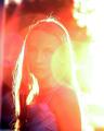
DPChallenge: A Digital Photography Contest You are not logged in. (log in or register
 
Browse Settings
Currently viewing:
Registered Usersixmacs

Show comments:

Per page:

Order:

Comments:


Comments Received by sixmacs
Pages:   ... ...
Showing 81 - 90 of ~225
Image Comment
lost in her eyes
09/08/2004 12:56:32 AM
lost in her eyes
by sixmacs

Comment by PhilipDyer:
I like this shot a lot because the light is really the subject of the photo, while not completely overpowering the woman. Very creative take on this challenge.
Photographer found comment helpful.
lost in her eyes
09/07/2004 10:49:10 PM
lost in her eyes
by sixmacs

Comment by Artyste:
I feel the light is just a little *too* bright. The idea is wonderful, but the wash-out just distracts me too much, and there's just not enough contrast in the model.
Photographer found comment helpful.
lost in her eyes
09/07/2004 09:28:36 PM
lost in her eyes
by sixmacs

Comment by PerezDesignGroup:
It's a nice effort but the light being cast from the right is quite distracting. It almost makes *me* squint.
Photographer found comment helpful.
lost in her eyes
09/07/2004 08:58:48 PM
lost in her eyes
by sixmacs

Comment by TechnoShroom:
While the flare is an interesting idea it completely overwhelms the image without providing any aesthetic or emotional impact.
Photographer found comment helpful.
lift
07/24/2004 05:50:03 PM
lift
by sixmacs

Comment by Spanish_Grease:
An awesome subject, but the noise in the background distracts greatly from the overall image. A tighter crop would have served this image very well.

Lee
Photographer found comment helpful.
drawn to the light
07/10/2004 08:06:19 PM
drawn to the light
by sixmacs

Comment by kevinswope:
It would be cool if the background and bottom surface had a seemless or blending apperance.
Photographer found comment helpful.
drawn to the light
07/10/2004 08:29:20 AM
drawn to the light
by sixmacs

Comment by thunderbug:
Gotta love iPods. I'm not too sure about the bright purple thing at the top of it though.
Photographer found comment helpful.
Tess
07/08/2004 09:46:35 PM
Tess
by sixmacs

Comment by graphicfunk:
from the Critique Club:
This is a very pleasant casual portrait. The colors all blend together, like the red from the lips, the red in the blouse, the red on the sofa or chair and the red in the picture.
However, if this were a formal portrait the eyes would not be so busy in observing the color scheme. One of the objects of a portrait is to concentrate on the face. You can show more than the face, but the ultimate detail must be expended in the face. So the first thing we do is use a plain wall such as that behind the subject. Now the subject gets all the attention with no competing objects to distract. The old masters always focused on the eyes, their liquid quality should be brought out.
Let us make this a better portrait. We need the same wall and, of course, you have light from one direction so you will have to find the right wall and sit Tess away from the wall. I would even close the aperture to 5.6 so as to increase the shutter speed. Now, we take any lamp in the house and remove the cover so as to expose the plain bulb. Turn it on and find a placement behind you or near you. The eyes will pick up the highlights. Now Tess has beautiful complexion and charming eyes. We will ask tess to release the smile, wet her lips and then gently begin to curl them. The current smile is real, but it is making her eye lids contract too much. We need the lower eye lids more relaxed. We are going for a half smile. Stop at the moment that the upper lip begins to thin. At this point the facial muscles will be half what they are, yielding a more relaxed pose and we will see the full shape of the bottom of the pupils. Every little bit helps. Shift the angle of the camera just enough to eliminate her right ear from view.
A word about selections and using GB. It is dangerous to blur a background from a portrait. Even tools such as extract fall short. I do a lot of selections and it takes me valuable time to perfect it. There is no magic automatic tool. It takes a few seconds to select and at least a half to a couple of hours to make corrections. Given the choice, simplify the background before the shoot. If you look at Tess on the left you will notice the feather blur next to her hair and unto the frame. While expert PS operators use GB to recompose their dof, you need to work on at least actual pixel size. It is best to give dof a good thought than relying on PS. Outside of this critical application GB has many uses. Yes, the 5.6 aperture will increase the dof, but since the wall is plain, a couple of feet will prove no problem.
Again, your photo as is is very pleasing and can hold its own as a very good casual portrait. Reconsider, keep this current nice image but but give yourself the challenge of a redo. I know Tess is happy with this effort, she will be happier with the next. dan
Photographer found comment helpful.
drawn to the light
07/07/2004 11:24:20 AM
drawn to the light
by sixmacs

Comment by nordic:
I want one........
Photographer found comment helpful.
Tess
07/04/2004 05:49:54 PM
Tess
by sixmacs

Comment by Neuferland:
This is a very lovely shot but the cropping could have been tighter on the left to take out the lamp, it's a distraction in the end. Also the print on the wall could be removed, giving you the solid background and then you could have cropped closer in on her face. Nice expression, good lighting. Started with a 4 but going to a 6
Photographer found comment helpful.
Pages:   ... ...
Showing 81 - 90 of ~225


Home - Challenges - Community - League - Photos - Cameras - Lenses - Learn - Help - Terms of Use - Privacy - Top ^
DPChallenge, and website content and design, Copyright © 2001-2025 Challenging Technologies, LLC.
All digital photo copyrights belong to the photographers and may not be used without permission.
Current Server Time: 04/07/2025 11:48:35 AM EDT.