| Image |
Comment |
| 05/24/2007 01:18:38 AM |
|
 Photographer found comment helpful. Photographer found comment helpful. |
| 05/23/2007 08:42:00 AM |
|
| Photographer found comment helpful. |
| 05/23/2007 04:19:22 AM |
|
| Photographer found comment helpful. |
| 05/22/2007 08:46:24 PM |
|
| Photographer found comment helpful. |
| 05/21/2007 09:06:15 AM |
|
| Photographer found comment helpful. |
| 05/21/2007 03:42:38 AM |
|
| Photographer found comment helpful. |
| 05/10/2007 06:24:42 PM |
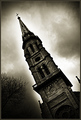
Salvationby nicklevyComment by timfythetoo: Greetings from the Critique Club -
First off - congrats on breaking out of your slump and having a new image in your top rated pics. That is always a cool thing.
You have an interesting and moody shot here. I think the editing suits it well in general. I really like the angle that the steeple is coming from and you caught some great detail on it. Sharp and clean with good contrast on the brickwork. Almost has a Gotham City/Batman kind of feel to it.
I think the heavy editing is fine, it sets the mood. I think that my only issue with the editing is the bottom left corner. You did a good job with the burning of the clouds up and around, but the left corner is overburned. I think I would have liked to have seen the trees be what gave most of the darkness there instead of the obviously heavy burning of the highlights and midtones behind it. The details of the tree could have been nice.
A good image overall. The voters liked it as a 6+ score in a FS is nothing to sneeze at. Good luck in future entries!
Tim |
| 05/07/2007 06:35:38 PM |
Salvationby nicklevyComment by adeldegan: Wow... The dodging and burning is a little obvious and strange, but the image is dramatic. |
| Photographer found comment helpful. |
| 05/05/2007 11:34:58 AM |
Salvationby nicklevyComment by Ben: I don't like the halo, to adds to the 'false, doctored' feel of the image. |
| Photographer found comment helpful. |
| 05/03/2007 09:27:29 AM |
Salvationby nicklevyComment by eamurdock: Nice color, texture, and tonal depth, I like the angle a lot (diagonals in composition and all). My biggest complaint is that the "aura" be a little softer and more subtle; it would look less "processed" that way. Also I'd continue the dodging clear to the edge of the frame on and around the building... |
| Photographer found comment helpful. |
Home -
Challenges -
Community -
League -
Photos -
Cameras -
Lenses -
Learn -
Help -
Terms of Use -
Privacy -
Top ^
DPChallenge, and website content and design, Copyright © 2001-2025 Challenging Technologies, LLC.
All digital photo copyrights belong to the photographers and may not be used without permission.
Current Server Time: 04/07/2025 09:35:43 AM EDT.