| Image |
Comment |
| 03/10/2009 08:39:25 PM |
Lindisfarne Castleby cthulhuComment by Ja-9: curves/levels...colors seem a bit flat, the poles are a little distracting...maybe a little step photography to the right then you wouldn't see the poles |
 Photographer found comment helpful. Photographer found comment helpful. |
| 03/10/2009 08:26:17 PM |
Lindisfarne Castleby cthulhuComment by Yo_Spiff: What a wonderful location! The comp leads my eye quite nicely. I do have to nitpick on the visibly tilted horizon, however. |
| Photographer found comment helpful. |
| 03/08/2009 11:13:41 AM |
|
| Photographer found comment helpful. |
| 03/04/2009 02:47:25 PM |
Light as a featherby cthulhuComment by David Ey: 1=don't want to have to look at this one ever again
2=bleh
3=neh
4=I just don't get it
5=no reaction
6=pretty nice shot
7=ooooh
8=unusually interesting
9=rave
10=instant fave
4 |
| 03/02/2009 08:08:16 AM |
|
| Photographer found comment helpful. |
| 03/01/2009 07:55:17 PM |
|
| Photographer found comment helpful. |
| 02/21/2009 05:03:33 AM |
|
| Photographer found comment helpful. |
| 02/20/2009 06:57:58 AM |
|
| Photographer found comment helpful. |
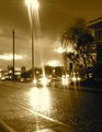
| 02/17/2009 07:24:05 PM |
Gaslightby cthulhuComment by kaiser_chief: The Noise in this photo is going to hurt you with Voters. The Flare from all of the lights also have caused large, overexposed areas that detract. This may have been the intent, but it doesn't work for me.. The colour of the Duotone also doesn't appeal for me. A straight Black and White may have worked better. |
| Photographer found comment helpful. |
Home -
Challenges -
Community -
League -
Photos -
Cameras -
Lenses -
Learn -
Help -
Terms of Use -
Privacy -
Top ^
DPChallenge, and website content and design, Copyright © 2001-2025 Challenging Technologies, LLC.
All digital photo copyrights belong to the photographers and may not be used without permission.
Current Server Time: 04/07/2025 11:54:24 AM EDT.