Life in Sandby
thekfactorComment by photokariangel: This is Kari Ann, greetings from the Critique Club:
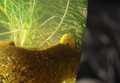
composition: the vase/bowl is positioned nicely in the frame
color: love the soft colors, very calm and natural. i dont, however, like the black in the background, i prefer the white as in your other shot.
contrast: nicely controlled, nothing overpowers.
focus: those little bubbles are in great focus, along with the rock (or whatever the yellow thing is).
depth of field: again, the black is very distracting. the white would have been much more subtle.
lighting: gorgeous lighting, its enchanting.
other: I think your lower scores from this were from the background, the confusing subject matter, and the lack of complete focus on the sand. However, upon a little more time looking this image over, I have grown to really enjoy it. Its almost like peeking into another world. I continue to enjoy looking and evaluating your images, keep up the good work! As always, if you have any other questions feel free to PM me.
-Kari Ann