| Image |
Comment |
| 02/08/2009 04:54:53 AM |
|
 Photographer found comment helpful. Photographer found comment helpful. |
| 02/03/2009 02:35:12 AM |
|
| Photographer found comment helpful. |
| 02/02/2009 08:15:56 AM |
old cold steelby thekfactorComment by tripz666: emmm:)..beautiful composition!.......perfect brightness and focus...nice texture and shades of grey.....with time standing still off focus.....it's a very nostalgic capture!..........cropped a lil more at the bottom and minus the specks on the table/surface + a cleaner surface of glass.... you would have an almost perfect picture!....."six"ty in focus and more be thy lucky average!:)...good luck!great job!:)....love this one!:)...... |
| Photographer found comment helpful. |
| 01/28/2009 04:26:45 AM |
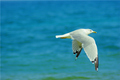
FLIGHTby thekfactorComment by spiritualspatula: ====Critique Club====
The first thing that strikes me about this image is the clarity of the gull- and especially the eye. You did a phenomenal job of stopping the motion. This is a bit of a two edged sword, however. On the one hand, you have awesome clarity, to the extent that you can see the bird's pupil clearly, as well as individual feathers. On the other, it makes the flight of the bird (which I think is a focal point) seem very static. Perhaps part of this effect is because the empty space was placed where the bird has already been, as several commenters noted, but it could also be due to the nature of the background. Although it isn't cluttered and therefore doesn't interfere directly with the foreground, it also doesn't add to the subject. Another approach to this shot that you could have tried is a motion pan- this technique does require practice but would be well suited to this. Having a slightly more active background, combined with a pan, would blur the background but also bring out the motion of the bird. This would add difficulty, but also improve the aesthetics of your shot. As it is, although the ocean backdrop is a nice, soothing scene, it gives no idea of the spatial relationship of the gull, becoming very similar to a blank blue sky.
The colors are very nice and saturated, and the exposure is very good, capturing the lights and darks of the gull (which can be pretty tricky to do). A little bit of additional contrast on the gull might have made it pop from the background a bit more, but I think a different background would have been more beneficial overall.
Keep in mind that a lot of times, for a wildlife shot to score well on DPC, the technicals have to be perfect, and in addition you need either an exotic creature or an exemplary capture of dramatic behavior or setting. Getting these all at the same time makes it 100% a game of timing. I think a lot of voters may have seen this just as a photo of an everyday gull, and voted it down because it wasn't terribly catchy in that sense.
All in all, great job and just keep plugging away until you get that perfect behavior with the perfect background with the perfect focus. Sounds easy, doesn't it? ;) |
| Photographer found comment helpful. |
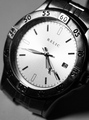
| 01/26/2009 07:55:59 AM |
A moment of thought...by thekfactorComment by TrollMan: I like the antique feel to the picture but the boring pen and pad takes away from it. Still over all a nice looking picture. Looks like you entered the challenge from a hotel room... haven't we all done that at least once? :) |
| Photographer found comment helpful. |
| 01/25/2009 05:41:33 AM |
A moment of thought...by thekfactorComment by tripz666: nothing seems to be in focus.........slightly sharper would've given good depth and dimension....but its a nice retro feel captured!reminiscential.....love the reflection on the base.....good job!..... |
| Photographer found comment helpful. |
| 01/24/2009 02:37:01 PM |
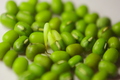
Survival of the 'wet'estby thekfactorComment by ursula: Greetings.
A difficult challenge, "Life". You have a good idea for it. However, the execution lets this down. There is nothing really in focus in the image, although to the middle of the image things are bit better in focus than towards the edges. In my view, it would have been much better to have something in focus here, in particular, the bean with the sprout, to make it the centre of attention. It also might have been good to arrange the setting a bit differently, not so centred, not just a bunch of beans next to each other in a small group. I even wonder if photographing just the one sprouted bean, maybe somehow including some dirt or some context to reinforce the idea of life sprouting and starting to grow, wouldn't work well. The slightly pink/purplish tones of the background also do not seem to enhance the green of the beans/sprout - it might be worth experimenting with different backgrounds, for example, totally white or black.
I hope this helps.
|
| Photographer found comment helpful. |
| 01/24/2009 12:11:26 AM |
|
| Photographer found comment helpful. |
| 01/23/2009 08:10:22 PM |
|
| Photographer found comment helpful. |
| 01/22/2009 10:28:39 AM |
A moment of thought...by thekfactorComment by M_Jayne: Would have played better if the accessories were less modern. Nice vignette and sepia tone but they do not go well with the motel pen and pad. |
| Photographer found comment helpful. |
Home -
Challenges -
Community -
League -
Photos -
Cameras -
Lenses -
Learn -
Help -
Terms of Use -
Privacy -
Top ^
DPChallenge, and website content and design, Copyright © 2001-2025 Challenging Technologies, LLC.
All digital photo copyrights belong to the photographers and may not be used without permission.
Current Server Time: 04/07/2025 07:28:00 AM EDT.