| Image |
Comment |
| 06/17/2003 03:42:13 PM |
|
 Photographer found comment helpful. Photographer found comment helpful. |
| 06/17/2003 12:01:59 AM |
|
| Photographer found comment helpful. |
| 06/11/2003 08:56:16 AM |
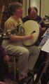
Sing Out! ( http://www.singout.org/ )by eloiseComment: The main subject looks unhappy and the movement has made the focus poor. The arm at the left of the picture is distracting and the man on the right is mostly obscured. I think it's too busy and not sharp enough to be a magazine cover, and it's also lacking any "wow" appeal. |
| Photographer found comment helpful. |
| 06/11/2003 08:49:22 AM |
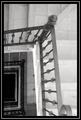
Architectural Digestby mcmurmaComment: Very crisp and clean but not especially inspiring. Fine for a magazine cover, though, as it would be much busier with the text, logo etc over it. |
| Photographer found comment helpful. |
| 06/11/2003 02:17:11 AM |
|
| Photographer found comment helpful. |
| 06/10/2003 11:10:31 PM |
Boating Lifeby mariomelComment: I'd have cropped out the bottom boat - it's very bright and distracting and detracts from the overall effect. |
| Photographer found comment helpful. |
| 06/10/2003 11:06:49 PM |
Martha Stewart Livingby nbortonComment: Little wrong with the image, technically but you chose a poor subject - that flower centre has bits falling off it and it's not that pleasing to look at. |
| Photographer found comment helpful. |
| 06/10/2003 11:03:51 PM |
The Church Timesby hughletherenComment: Too much of the church view is blocked by leaves and trees - I don't think this would be good enough to make it to a cover. |
| Photographer found comment helpful. |
| 06/10/2003 10:44:09 PM |
Vogueby danh669Comment: Not sure about how you've cropped off the right of her hair and there's a bit of hair hanging down in the middle of her forehead annoyingly. |
| Photographer found comment helpful. |
| 06/10/2003 10:43:12 PM |
Travel & Leisureby brentpaughComment: I'm not sure why - perhaps because of the fairly harsh lighting casting shadows, but your model looks like she is floating or pasted into the picture, esp around her left leg. |
| Photographer found comment helpful. |
Home -
Challenges -
Community -
League -
Photos -
Cameras -
Lenses -
Learn -
Help -
Terms of Use -
Privacy -
Top ^
DPChallenge, and website content and design, Copyright © 2001-2025 Challenging Technologies, LLC.
All digital photo copyrights belong to the photographers and may not be used without permission.
Current Server Time: 04/09/2025 10:01:31 AM EDT.