| Image |
Comment |
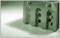
| 05/27/2003 05:46:24 AM |
Cold Steelby MitonskiComment: Interesting choice of shade for this -- I would have tended to think of a bluer tone for the 'cold' part but the greenish tinge actually works quite well. |
 Photographer found comment helpful. Photographer found comment helpful. |
| 05/27/2003 05:44:08 AM |
Shadow Danceby autoolComment: I like the angle you did this at, makes the shadow very interesting with that curvature. A good subject for a duotone topic, IMO. |
| Photographer found comment helpful. |
| 05/27/2003 05:42:05 AM |
Hello thereby MusicmanComment: I was trying to think of something clever to say involving bulls, but I'm afraid it's too early in the morning. Not a topic that grabs me -- being from the Midwest I've seen far too many of these -- but I do like the up-close-and-personal shot of it and the black and white colouring suits it well. |
| Photographer found comment helpful. |
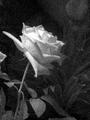
| 05/27/2003 05:40:21 AM |
Rose an artistic interpretationby EJComment: I like the grainy look of this photo, although I'm curious why given that you didn't choose to go with sepia. It looks good in B&W, mind you; it's a nice shot, the flower stands out well from the background and it's a good angle. But I associate grainy with old, and therefore am more inclined to think sepia. |
| Photographer found comment helpful. |
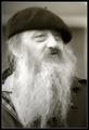
| 05/27/2003 04:40:46 AM |
Oldtimer by kiwinessComment: Hrm. Maybe a slightly more sepia tone to emphasize the 'old' part? I'm not sure, there's just a little tinge of dissatisfaction in me in this. The shot may be a little too crisp, alternately, for the tone. |
| Photographer found comment helpful. |
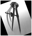
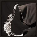
| 05/27/2003 04:39:34 AM |
Looks Can Killby magnusComment: I almost missed that the face was visible in the knife at first. As interesting as that blade is, I wonder if something a little less irregularly shaped would have worked better for this. Maybe a slightly different angle so the eye wasn't nearly cut off? (No pun intended.) |
| Photographer found comment helpful. |
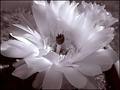
| 05/27/2003 04:38:00 AM |
Catus Flowerby sherryk471Comment: I do like the shade chosen for this. The focus on the flower may be a little too close, as the missing edges of petals is a little too obvious. |
| Photographer found comment helpful. |
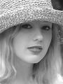
| 05/27/2003 04:26:45 AM |
Whitneyby draney4Comment: A nice portrait photo that is well suited to B&W. Very pretty model. I like the lighting and the way it catches the hair. |
| Photographer found comment helpful. |
| 05/27/2003 04:26:08 AM |
Flashby RefractedComment: Neat. Not a topic I would have ever thought of, myself, but it works very well in the tone it's in, seems perfectly natural to see it in that colour, except for the very distracting Pepsi cans in the background. If it weren't for the modern design on those it would have come across well as an old photograph, which is how the rest of it feels. |
| Photographer found comment helpful. |
| 05/27/2003 04:24:45 AM |
Splashby e301Comment: Although it looks good in B&W, this subject has been done to death, so my interest level is a little low. It is an interesting angle to do this at. |
| Photographer found comment helpful. |
Home -
Challenges -
Community -
League -
Photos -
Cameras -
Lenses -
Learn -
Help -
Terms of Use -
Privacy -
Top ^
DPChallenge, and website content and design, Copyright © 2001-2025 Challenging Technologies, LLC.
All digital photo copyrights belong to the photographers and may not be used without permission.
Current Server Time: 04/08/2025 04:36:48 AM EDT.