| Image |
Comment |
| 05/24/2007 10:51:30 PM |
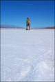
Hot Kissesby Ian-AndrewComment: neat shot idea but i wish they were both wearing white? something more hmm fitting for being on ice.
oo and btw, why is she holding his butt? lol tell her grab bit higher haha |
 Photographer found comment helpful. Photographer found comment helpful. |
| 05/24/2007 10:49:14 PM |
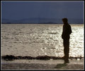
The Watcherby JedusiComment: i like the highlight on him too, just hate the horizon cutting his head off. bit lower would have been perfect.
great shot!! |
| Photographer found comment helpful. |
| 05/24/2007 10:47:55 PM |
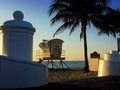
Lifeguard Stationby bdennyComment: just seems to cluttered up for my tastes. id rather have 2 or 3 objects then 5 or 6. they are all competing with who should be the main one! |
| Photographer found comment helpful. |
| 05/24/2007 10:46:05 PM |
|
| Photographer found comment helpful. |
| 05/24/2007 10:41:21 PM |
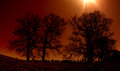
_MG_7000.jpgby dahkotaComment: creepy feel to it. but, id like either NO sun in shot or all of the sun in the shot. just seeing that small bit distracts from the shot imho. |
| Photographer found comment helpful. |
| 05/24/2007 10:32:26 PM |
Zabriskie Pointby Ian-AndrewComment: to me it just looks like flat lighting. it needs some depth ie shoot either morning or later in day near sundown. i wanna see some shadows! |
| Photographer found comment helpful. |
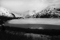
| 05/24/2007 10:26:12 PM |
Portage Glacierby ShutterPugComment: yeah, id like the foreground trees not pure black and id love some "mood" in the sky. some clouds or something instead of stark white. |
| Photographer found comment helpful. |
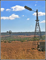
| 05/24/2007 10:25:02 PM |
Old-and-New-Windmill-2325.jpgby Monique64Comment: yeah, id rather have the windmill in the front and this whole picture shot with a longer longer longer lens to try and bring up the size of the back one.
too much of a height difference between the two imho. |
| Photographer found comment helpful. |
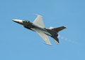
| 05/24/2007 10:18:31 PM |
Burnin'by renegade1966Comment: yeah, i wish had some clouds or more variety in colors to the sky. it looks like a plane against a blue screen.Awesome shot tho. i know how hard it is to get a good picture cuz that plane is zoooooming by fast! |
| Photographer found comment helpful. |
| 05/24/2007 10:15:17 PM |
Michelleby escapetoozComment: think the flash was a bit too much. id go for 1 stop or 2 stops less exposure and try get some directional lighting if can.
and, one more thing, the pose looks too "posed". too much tension on her shoulders. Id bring her hands a bit farther apart and have her not stick her chest out. |
| Photographer found comment helpful. |
Home -
Challenges -
Community -
League -
Photos -
Cameras -
Lenses -
Learn -
Help -
Terms of Use -
Privacy -
Top ^
DPChallenge, and website content and design, Copyright © 2001-2025 Challenging Technologies, LLC.
All digital photo copyrights belong to the photographers and may not be used without permission.
Current Server Time: 04/07/2025 10:02:31 PM EDT.