Billby
DiComment: From the Critique Club
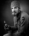
I like the fact that he is in the middle of the picture, it suites him.
You used a rather big aperture so a little amount of the picture is in focus. It comes out nicely.
The background is distracting for me, it would had been better if it was straighter.
One can also see where you cloned out something next to the year.
The light is nice, no harsh shadows or blown out highlights.
But you are missing so many tones of black and white in it, it's mostly just grey. This is easily fixable with levels and curves in Photoshop.
I think you might also consider a little tighter cropping.
The pose is nice; he doesn�t look scary at all to me.
Feel free to contact me through the PM system if you have any comments or questions about my critique.