| Author | Thread |
|
|
01/17/2007 08:53:15 AM |
From the Critique Club
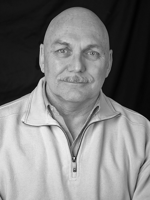
I like the fact that he is in the middle of the picture, it suites him.
You used a rather big aperture so a little amount of the picture is in focus. It comes out nicely.
The background is distracting for me, it would had been better if it was straighter.
One can also see where you cloned out something next to the year.
The light is nice, no harsh shadows or blown out highlights.
But you are missing so many tones of black and white in it, it's mostly just grey. This is easily fixable with levels and curves in Photoshop.
I think you might also consider a little tighter cropping.
The pose is nice; he doesn’t look scary at all to me.
Feel free to contact me through the PM system if you have any comments or questions about my critique.
|
|
 Photographer found comment helpful. Photographer found comment helpful. |
Comments Made During the Challenge  |
|
|
01/12/2007 09:03:19 PM |
| Nice warm shot. Could use a bit more cropping right and bottom IMO. - 7 |
|
| Photographer found comment helpful. |
|
|
01/11/2007 11:27:07 PM |
| This has nice potential but there are no mid tones. Maybe a levels adjustment would give it more pop. |
|
| Photographer found comment helpful. |
|
|
01/10/2007 12:41:13 PM |
| This could be a nice portrait, but the man looks too uncontrasty against the very black background. Otherwise it's good. |
|
| Photographer found comment helpful. |
|
|
01/10/2007 10:24:14 AM |
| Sweet simple and well done. |
|
| Photographer found comment helpful. |
Home -
Challenges -
Community -
League -
Photos -
Cameras -
Lenses -
Learn -
Help -
Terms of Use -
Privacy -
Top ^
DPChallenge, and website content and design, Copyright © 2001-2026 Challenging Technologies, LLC.
All digital photo copyrights belong to the photographers and may not be used without permission.
Current Server Time: 02/01/2026 12:27:53 PM EST.