| Image |
Comment |
| 03/04/2003 10:47:03 AM |
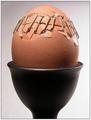
Amnestied by ndsComment: The texture is what made me vote ten on this shot. Plus the engaging subject matter. Great range of earth tone colors too. |
 Photographer found comment helpful. Photographer found comment helpful. |
| 03/04/2003 10:46:24 AM |
To Kill a Chickenby jenaromComment: The contrast between the sharpness of the knife and the softness of the egg is wonderful This is added to by the sharpness of focus on the knife and softness of focus on the egg. Good range of tones for a black and white shot. |
| Photographer found comment helpful. |
| 03/04/2003 10:45:17 AM |
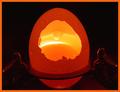
Sunrise in the Cosmic Egg by BitzComment: The lighting on this shot is really great. It gives a very cosmic quality to the rather banal subject of an egg. I think it fits the challenge perfectly, instilling interest into the rather boring subject that is the egg. |
| Photographer found comment helpful. |
| 02/25/2003 11:28:51 AM |
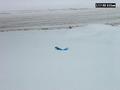
My newspaperby Crafty SueComment: I'm not sure if the date in the corner is something the camera added, or if it was added later, but it really detracts from the shot. Otherwise, it's sort of out of focus, and the focal point is lost amid the snow. I think this shot would be stronger if you had concentrated more on the paper, gotten a little tighter and more focused shot. |
| Photographer found comment helpful. |
| 02/25/2003 11:27:00 AM |
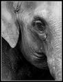
Set Me Freeby NatashaComment: Wonderful texture, and detail. I would like it if the deeper blacks were perhaps darker. It's hard to convey human emotions effectively to animals (I think it is anyway), but this shot does it well. |
| Photographer found comment helpful. |
| 02/25/2003 11:24:48 AM |
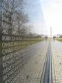
The Wallby miphotosComment: The reflection in this shot is used wonderfully. The lines created by the names, and the bottom part of the wayy, work well to lead the iewer's eyes towards the monument in the background. The colors are present, but they're muted enough to fit the challenge. Good work. |
| Photographer found comment helpful. |
| 02/25/2003 11:23:37 AM |
Trouble In Paradiseby GeneralEComment: The background is a little too gray for my taste. I think that this shot would be better if the background had a little personallity to it. Otherwise it's an interesting contrast, and the two main objects have good color and sharpness. |
| Photographer found comment helpful. |
| 02/25/2003 11:22:25 AM |
Collateral Damageby ndsComment: Woh! Great shot. The balance between light and dark is perfect, and the title fits the content of the shot (which in turn fits the content of the challenge). |
| Photographer found comment helpful. |
| 02/25/2003 11:21:28 AM |
Depressionby KimInNBComment: Great colors. I especially like the shadows. It really conveys the message of the challenge, without being heavy handed or trite. |
| Photographer found comment helpful. |
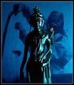
| 02/25/2003 11:20:47 AM |
Peace or Xxxby ZiggyComment: I enjoy the contrasts here. The softness of the statue, and the hardness of the image behind it. The statue looks a little bit over exposed in some spots (like where the light is creating its whitest spots), but this doesn't really detract from the image -- it almost gives it a painting like quality. |
| Photographer found comment helpful. |
Home -
Challenges -
Community -
League -
Photos -
Cameras -
Lenses -
Learn -
Help -
Terms of Use -
Privacy -
Top ^
DPChallenge, and website content and design, Copyright © 2001-2025 Challenging Technologies, LLC.
All digital photo copyrights belong to the photographers and may not be used without permission.
Current Server Time: 04/09/2025 01:24:08 PM EDT.