| Image |
Comment |
| 11/19/2006 07:45:49 PM |
|
 Photographer found comment helpful. Photographer found comment helpful. |
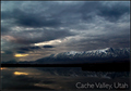
| 11/19/2006 07:45:09 PM |
Greetings from Cache Valley!by dsidwellComment: VERY nice, and VERY nicely not overdone! The detail is really nice in the sky without being over the top. And I really like that it isn't over saturated. The one thing I might fix is moving the text over to the left to balance it out, although I'm not judging on that. 10 for a great photo, and a refreshingly not overdone photo! |
| Photographer found comment helpful. |
| 11/19/2006 07:43:28 PM |
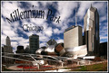
Sunset By The Bayby jdannelsComment: LOVE the sky, LOVE the cityscape. There's a ton of detail in it. And I love how the foreground is so nice and simple. The water I assume? The one thing I would fix is the text. if you made it a bit smaller it might relieve the tension of the tet being so close to the edges. On the other hand, it is kind of cool that the city is kind of sitting on the words...Enough of my rambling! I'm betting this will be on the top! |
| Photographer found comment helpful. |
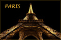
| 11/19/2006 07:41:44 PM |
Paris by Nightby MatthewComment: The vantage point is very nice, and you got a lot of nice detail in the entire structure. It's like I can see every beam! And the background is so nice and black. |
| Photographer found comment helpful. |
| 11/19/2006 07:40:57 PM |
Clarksville Mornby rayg544Comment: I like text of "clarksville" in the photo. It is also kind of tells a story of a town; it gives the kind of small town feel, since the station is so small. I think the image could be rotated a few degrees counterclockwise to straighten things out, and also the blue text seems a bit too bright. |
| Photographer found comment helpful. |
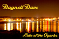
| 11/19/2006 07:39:08 PM |
Night at the Damby bryantbusComment: I like the yellow hue of the photo from the lights, and like the mixture of light color. The reflection is also very nice. The photo is a bit grainy though. |
| Photographer found comment helpful. |
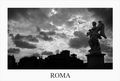
| 11/19/2006 07:38:01 PM |
Romeby pmottaComment: I like that there is more detail in the statue, so I don't get distracted to the buildings in the backround, which seem not as elegant as the statue. A little more detail in the statue might have been nice, though I'm sure that would have been hard since the sky is exposed very well. 8 |
| Photographer found comment helpful. |
| 11/19/2006 07:35:47 PM |
Postcard IIby MayaMComment: Very nice sky, and the architecture is awesome. I don't really like the warped text though. It kind of distracts. |
| Photographer found comment helpful. |
| 11/19/2006 07:34:51 PM |
|
| Photographer found comment helpful. |
| 11/19/2006 07:33:41 PM |
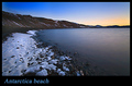
66°Northby Ragga2000Comment: I really like the leading line of the coast line, and the snow adds a lot too. |
| Photographer found comment helpful. |
Home -
Challenges -
Community -
League -
Photos -
Cameras -
Lenses -
Learn -
Help -
Terms of Use -
Privacy -
Top ^
DPChallenge, and website content and design, Copyright © 2001-2025 Challenging Technologies, LLC.
All digital photo copyrights belong to the photographers and may not be used without permission.
Current Server Time: 04/08/2025 06:16:36 AM EDT.