| Author | Thread |
|
|
11/29/2006 10:37:39 AM |
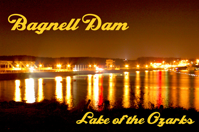
| A little grainy in the sky, but not too terribly bad. The design of the card is really quite nice - well balanced and the text fits well without interrupting the picture. I notice a lot of folks thought the lettering was too big, but seems to me a lot of postcards look just like this as far as text, size and where it's placed. I love the two streaks of red - really adds a nice touch. This could be a bit "crisper" if exposed just a little less, maybe. I find with night photography that underexposing is better than overexposing. With this shot, you can make it darker in post but you will emphasize the grain when you do. Try levels and bringing the top of the sky to black then add a bit of sharpening - gives a different look to it. |
|
 Photographer found comment helpful. Photographer found comment helpful. |
|
|
11/27/2006 05:39:00 AM |
| I agree with what the other commenters said. Try toning it down quite a bit to see what you get. Look at the other shots in this challenge that use lights reflecting on water as models. |
|
| Photographer found comment helpful. |
Comments Made During the Challenge  |
|
|
11/26/2006 11:25:38 AM |
| Great reflections and I love the gold colour. |
|
| Photographer found comment helpful. |
|
|
11/25/2006 01:50:44 AM |
| The text overwhelms the delicate lights and reflections on the water. I'd like to see less grain, too. The positives for me are the colors (love the reds!) and the way the river curves off towards the right. I find the blown parts of the lights to be a bit overwhelming, and wonder how it might be if the entire image were a bit darker. I do like the way the shore frames the bottom of the image. |
|
| Photographer found comment helpful. |
|
|
11/24/2006 07:41:42 PM |
| Beautiful colors, but too many blown highlights |
|
| Photographer found comment helpful. |
|
|
11/22/2006 08:53:56 AM |
| The overall brown color is not appealing to me. I like the graphics and the composition. I wish the the far shore was sharper. |
|
| Photographer found comment helpful. |
|
|
11/21/2006 04:36:33 PM |
| too much yellow - and the font is too fat |
|
| Photographer found comment helpful. |
|
|
11/20/2006 06:26:34 AM |
Technical: The lights are bothersome when looking at the photo. Too bright, too much of an orange tent. The orange color then saturates more than half of the photo (even areas where there is no light). You don't see much detail of what you are looking at. There also isn't much focus in your subject.
Other: Compared to most of the other photos in this challenge it is of lower quality (but this challenge is also filled with some AMAZING photos). So don't be discourage by a lower score. |
|
| Photographer found comment helpful. |
|
|
11/20/2006 03:56:34 AM |
| quite noisy and a little blurred, text is too large IMO. Nice font and colors |
|
| Photographer found comment helpful. |
|
|
11/19/2006 11:14:47 PM |
| a bit to blurred for me as a postcard |
|
|
|
11/19/2006 07:39:08 PM |
| I like the yellow hue of the photo from the lights, and like the mixture of light color. The reflection is also very nice. The photo is a bit grainy though. |
|
| Photographer found comment helpful. |
|
|
11/19/2006 07:28:50 PM |
| luminous...a bit too much |
|
| Photographer found comment helpful. |
Home -
Challenges -
Community -
League -
Photos -
Cameras -
Lenses -
Learn -
Help -
Terms of Use -
Privacy -
Top ^
DPChallenge, and website content and design, Copyright © 2001-2025 Challenging Technologies, LLC.
All digital photo copyrights belong to the photographers and may not be used without permission.
Current Server Time: 04/07/2025 12:49:33 AM EDT.