| Image |
Comment |
| 09/04/2006 06:25:10 PM |
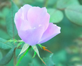
Pretty in Pinkby NstiG8trComment: The color tones are unusual here. You dont see to many seafoam green colored backgrounds. Its fresh. The flower doesn't look quite right. The bottom of the forward petal doesnt look like it belongs. The edge looks to sharp like its been pasted into place. It also seems to have a different amount of focus than the sepals. I think you have also lost detail and texture in the petals that should be there. |
 Photographer found comment helpful. Photographer found comment helpful. |
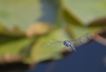
| 09/04/2006 06:03:33 PM |
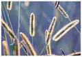
morning lightby sherComment: I love the pastel background against the backlit grass fuzzies. The two blue things hanging down on top really grab the attention. They really need removed somehow. |
| Photographer found comment helpful. |
| 09/04/2006 06:00:57 PM |
|
| Photographer found comment helpful. |
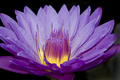
| 09/04/2006 05:59:08 PM |
Edibility Factorby hotpastaComment: Was the blur achieved in camera or added in photoshop? It feels to dramatic. would have preferred less blur. I like how it looks like scooped ice cream. Vanilla, butterscotch, strawberry, chocolate and blue raspberry. Not sure what to call the purple one. ;) |
| Photographer found comment helpful. |
| 09/04/2006 05:54:45 PM |
|
| Photographer found comment helpful. |
| 09/04/2006 05:53:24 PM |
|
| Photographer found comment helpful. |
| 09/04/2006 05:50:02 PM |
Final Approachby cabaComment: This is difficult to achieve. I really don't care for the distracting background. I know shots like this can't be helped. Seems the dark tones are a tad noisy. I applaud you on the difficulty of this shot but its not really working for me, sorry. |
| Photographer found comment helpful. |
| 09/04/2006 05:46:36 PM |
Revelationsby ImagineerComment: omg I love this! Its simple, delicate and very eye appealing! A very thought provoking title! 10 |
| Photographer found comment helpful. |
| 09/04/2006 05:38:51 PM |
Inner lightby MattOComment: Vibrant colors! Crisp clarity. There are some white specks in the lower right petals I would have removed. I would also have blackened the entire background since the majority of it is already black. The green is a bit distracting. |
| Photographer found comment helpful. |
| 09/04/2006 05:35:29 PM |
Morning Gloryby newtune3Comment: Im not crazy about the color tones. I would have altered it in photoshop to boost the blues/pinks better. Looks like the ISO might have been a bit high as you have some noise in the dark areas. I might have flipped this image to show the rays coming downward as we would expect them to be even though they may not have been. I like the shape of the cloud. Looks like a hand holding the sun if it had been flipped. |
| Photographer found comment helpful. |
Home -
Challenges -
Community -
League -
Photos -
Cameras -
Lenses -
Learn -
Help -
Terms of Use -
Privacy -
Top ^
DPChallenge, and website content and design, Copyright © 2001-2025 Challenging Technologies, LLC.
All digital photo copyrights belong to the photographers and may not be used without permission.
Current Server Time: 04/07/2025 10:05:51 PM EDT.