| Image |
Comment |
| 07/01/2006 08:59:54 PM |
Break 'em!by jdannelsComment: A nice idea, a bit overdone. Maybe a slightly faster exposure would have worked better - still enough blur to create the sense of a fast break, without it being all blur and no substance. |
 Photographer found comment helpful. Photographer found comment helpful. |
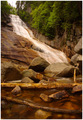
| 07/01/2006 08:50:48 PM |
Ripley Fallsby sysopComment: Nice shot. The sense of movement in the water loses momentum in the lower third of the shot, though; which leaves it a bit thematically disjointed to my eye. |
| Photographer found comment helpful. |
| 07/01/2006 08:48:46 PM |
Hulk in Trainingby littlegettComment: The photo works well; but the title detracts a little, I think.
I like the dark, satanic feel of the photo - darkness, anger, grit; all emphasised by the strong reds. Well done. But find a title that plays to these themes - "Hulk in training" is too flippant. |
| Photographer found comment helpful. |
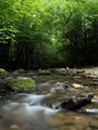
| 07/01/2006 08:43:27 PM |
Waterby sabphotoComment: This shot works well.
I might've been inclined to crop away maybe the top quarter or third of the trees, just to make the photo a little less "half and half", and to emphasise the idea of the stream emerging from the wooded darkness. But the sense of motion in the water is strong - as is the "primeval" feel of it all, enhanced by nice touches such as the moss on the rocks. |
| Photographer found comment helpful. |
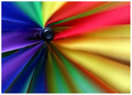
| 07/01/2006 08:38:34 PM |
Color wheelby jaxedComment: Lovely use of colour. Everything works to draw the eye to the spindle, keeping it pleasantly amused along the way.
The contribution of motion blur to this is subtle, but effective. |
| Photographer found comment helpful. |
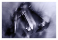
| 07/01/2006 08:35:39 PM |
Keys Spiritsby Dax-Comment: A nice execution of the technique - and effective use of duotone.
A shame that one of the keys is slightly clipped at the top of the pic. And, for me, just a little off the mark in terms of evoking a sense of anything... |
| Photographer found comment helpful. |
| 07/01/2006 08:29:59 PM |
Mom's Day Offby margiemuComment: LOL! Great concept, well executed. Maybe could've done a little more with the lighting of the subjects in the background. |
| Photographer found comment helpful. |
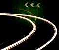
| 07/01/2006 08:27:04 PM |
Turn Leftby TygerrComment: A nice juxtaposition of the headlight trails with the "bear left" chevrons.
I think the image could be improved by straightening it, so that the chevrons are properly horizontal. And the exposure of the chevrons is too grainy, and the chevrons themselves too dilapidated, for this to be a really great shot. But take the concept to somewhere where you have some less scruffy roadsigns and a better opportunity to expose the shot well, and you'll have something good.
Finally, I can't help but notice that these look like headlight trails, not tail-light trails. Which of course means that the vehicle would've been turning right! :-) |
| Photographer found comment helpful. |
| 07/01/2006 08:19:42 PM |
Shake Your Booty!!by SammieComment: LOL!
Nicely done. Maybe could've done with being slightly less tightly cropped, to capture more of the motion happening just out of shot on the right. And I am left with the impression that I'm looking at a one-armed booty shaker! |
| Photographer found comment helpful. |
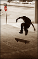
| 07/01/2006 08:13:50 PM |
No Skateboarding Allowedby timfythetooComment: When I look at this shot, I can hear the skateboard as it clatters back to the ground. Very evocative.
Some of the background is a little distracting, though. Maybe it would have worked better if the stop-sign had been cropped out, for instance. I can see what you're trying to do with the stop-sign - with its touch-colour red and the title of the photo - but it isn't really adding to the scene for me. Maybe if the sign was in focus and more closely juxtaposed with the subject...
I'd have tried losing the stop-sign and some of the foreground pavement, but leaving the median-strip and parked cars as background, to impart the sense of "urban street scape".
But for all that, still very evocative. |
| Photographer found comment helpful. |
Home -
Challenges -
Community -
League -
Photos -
Cameras -
Lenses -
Learn -
Help -
Terms of Use -
Privacy -
Top ^
DPChallenge, and website content and design, Copyright © 2001-2025 Challenging Technologies, LLC.
All digital photo copyrights belong to the photographers and may not be used without permission.
Current Server Time: 04/07/2025 10:11:39 PM EDT.