| Image |
Comment |
| 06/21/2006 08:21:28 AM |
Mixing of Colorby deepfrog17Comment: Now this is quite special, and well done too... Nice color, nice blurry water, and that's especially interesting since the glass is sharp of course... |
 Photographer found comment helpful. Photographer found comment helpful. |
| 06/21/2006 08:10:40 AM |
Heaven2Ocean - H2Oby B74AComment: Technically good. Composition is well thought out too... Concept is perhaps the least interesting in this picture. |
| Photographer found comment helpful. |
| 06/21/2006 08:07:24 AM |
Make A Wish.by aleahjusticeComment: The main subject of a picture can of course be much darker than the background, but why, in this case...? There is a tilt as well, and background is overall very distracting. Best regards. |
| Photographer found comment helpful. |
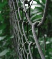
| 06/21/2006 08:05:29 AM |
vine incursionby dmaddenComment: Interesting.. Good depth-of-field, but colors are not adding much. better in black and white, perhaps ? And what about a sunny day to reshoot this ? And how about a squarish composition ? |
| Photographer found comment helpful. |
| 06/21/2006 08:01:04 AM |
Summer medowby MudHutComment: The blurry flower at back (center) is too central and detracts from the 2 main (sharp) flowers. Otherwise nice. |
| Photographer found comment helpful. |
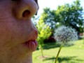
| 06/21/2006 07:59:55 AM |
Cheers to Bokeh!by BosborneComment: Very good lighting. It feels fresh. If composition was a bit less heavy at the bottom, and if glasses were not cut off the way they are, composition would be much better. Glasses area bit too full too. Depthof field is excellent. |
| Photographer found comment helpful. |
| 06/21/2006 07:55:13 AM |
Nature's Touchby AeroglyphicsComment: The concept is not entirely convincing for me, but the picture is well composed and well lit. Quite good. The bright mass at top and dark mass at bottom are nevertheless a bit too strong, visually. The edge of the trees at right are mildly distracting too. But nothing really hurts the eye, and it's overall well done and well composed. |
| Photographer found comment helpful. |
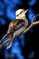
| 06/21/2006 07:51:48 AM |
"Kooka-bokeh"by JudiComment: Nice colors, nice light - although the top of thehead is washed out -, good composition. |
| Photographer found comment helpful. |
| 06/21/2006 07:45:41 AM |
Focus on the challengeby diablo2097Comment: Good usage of Depth of field here, andgood composition. Perhaps not veryoriginal, but nice. As a side-note, and basedon your title, don't you think the whiteball should rather be at the end of the queue as in shooting position ? That would be more "focussed", conceptually thinking, no...? Best regards. |
| Photographer found comment helpful. |
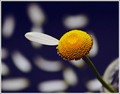
| 06/21/2006 07:02:08 AM |
She Loves You by MayaMComment: I like the concept, but the execution is only "average" to me. Why? Firstly, I don't really like the black background - although I can see why you wanted it dark. 2nd, I like the concept of having blurry petals in the background, although I find the placement of the bright spots within the composition a bit too systematic. 3) The light seems to be the light of some clousy day - and although it fits the concept, I think I'd have prefered a more appealing light. 4) I don't think this odd farmat was the best to convey your message. Perhaps a square was more appropriate - possibly with a little more negative space around the flower...? 5) The slightly more complex and blurry part that's behind the flower at corner bottom right adds nothing to the rest of the picture, and therefore would better be left out of the frame - although it isn't really annoying. Overall, still a good concept and a fairly good photo: I was just looking for possible improvements. Best regards. |
| Photographer found comment helpful. |
Home -
Challenges -
Community -
League -
Photos -
Cameras -
Lenses -
Learn -
Help -
Terms of Use -
Privacy -
Top ^
DPChallenge, and website content and design, Copyright © 2001-2025 Challenging Technologies, LLC.
All digital photo copyrights belong to the photographers and may not be used without permission.
Current Server Time: 04/08/2025 04:36:48 AM EDT.