| Image |
Comment |
| 01/28/2011 07:13:15 AM |
|
 Photographer found comment helpful. Photographer found comment helpful. |
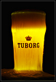
| 10/10/2006 05:49:39 PM |
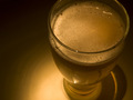
TUBORGby GautiComment: Sweet catch on the foam over. Has that preternatural golden glow that we want the beer in front of us to have. |
| Photographer found comment helpful. |
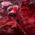
| 10/10/2006 05:25:36 PM |
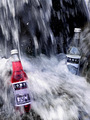
Izze Sparkling Pomegranate - Refreshingly Redby lindesComment: Very cool abstract approach, well executed. Stands out. Wouldn't immediately recognize it as a beverage if weren't identified but that's good, the unconventional view is the source the appeal. |
| Photographer found comment helpful. |
| 10/10/2006 08:03:54 AM |
Guinness, The Timeless Classicby cutlassdude70Comment: Knockout pairing, perfect color pallette. I can hear it now: "You have lovely hair and skin. It reminds me of Guinness." Fine touch with lighting. Every choice on target. Why go on? Perfect. Congratulations. |
| Photographer found comment helpful. |
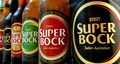
| 10/10/2006 07:52:02 AM |
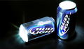
Selectionby xvixComment: Stout brand statement complements product name by projecting strength through primary colors of labels and shoulder-to-shoulder composition. Lit just right, strong but not over-the-top. Advertisers love this sort of image. I want one. |
| Photographer found comment helpful. |
| 10/10/2006 07:41:44 AM |
|
| Photographer found comment helpful. |
| 10/10/2006 07:39:00 AM |
Smoothby behindthescenesComment: Good, strong bar card image with upscale brand the star of the show rather than the stuff inside, per advertisers' familiar strategy of targeting affluent demographic. Neutral background keeps eye on beautiful green package.This is a "buy." Well done. |
| Photographer found comment helpful. |
| 10/10/2006 07:22:02 AM |
Jones Sodaby stare_at_the_sunComment: Very effective. Great composition. Says "refreshing." Makes me want one which is just what a good product image is supposed to do. Eye goes straight for red soda well-placed in corner of frame. Why clear (empty?) on the back bottle? |
| Photographer found comment helpful. |
| 10/10/2006 07:17:46 AM |
Golden Amberby TlemetryComment: Great angle and composition. Deft lighting touch (feathered spot?) Not sure the monochromatic pallette is best choice. Wonder what this would have looked like with color counterpoint |
| Photographer found comment helpful. |
| 10/10/2006 07:09:55 AM |
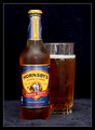
Traditional & Dryby esdarbyComment: Standard, space-efficient bar card composition. The brew needs back or sub light to make it pop from dark bacground. Try gold foil strip strategically placed behind glass and bottle or cut hole in base material (towell?) and fire light up from underneath. Add salt to increase/maintain head during shoot. Good start. |
| Photographer found comment helpful. |
Home -
Challenges -
Community -
League -
Photos -
Cameras -
Lenses -
Learn -
Help -
Terms of Use -
Privacy -
Top ^
DPChallenge, and website content and design, Copyright © 2001-2025 Challenging Technologies, LLC.
All digital photo copyrights belong to the photographers and may not be used without permission.
Current Server Time: 04/07/2025 08:51:49 AM EDT.