| Image |
Comment |
| 01/29/2003 05:10:57 PM |
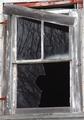
Broken Reflectionsby KazComment: Nice shot, it,s the kind of image I imagined would win this challenge. Good Luck!JG |
 Photographer found comment helpful. Photographer found comment helpful. |
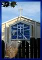
| 01/29/2003 05:08:29 PM |
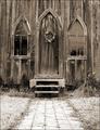
Garden Churchby ShiiizzzamComment: Good perspective, texture, shape and form, line ane even a little reflection all add up to a quality picture. One of the things I try and encourage my students to do is not shoot straight on at an image. If you you were to move a little to the left or right of the side walk it would add a little creativity to the work. JG |
| Photographer found comment helpful. |
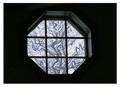
| 01/29/2003 04:54:26 PM |
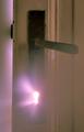
Through the Keyholeby jimmyn4Comment: I like the simplicity of the pic. works well with the light shining through the key hole. I also like the soft violet colors that contrast with the wood color. Good Job! John Gill |
| Photographer found comment helpful. |
| 01/29/2003 04:44:51 PM |
Craftsmanshipby AzrifelComment: They just don't make them like they used to! Nice cropping and you captured the theme of the challenge. The color of the border really distracts from the picture. No points off, but a solid dark blue might have worked more to your advantage. |
| Photographer found comment helpful. |
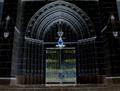
| 01/29/2003 04:40:51 PM |
Heaven's Gate?by GeneralEComment: As the picture started to emerge on the screen I thought oh no another church. But, I like the way the title and the gate work together. The lighting on the gate is great, I will assume you could not get that lighting or it needed to be in shadows so you could see the image of the stain glass. Personnally I would like to have seen some light hitting the window. But won't subtract points for what I would like to see. Good Luck, John Gill |
| Photographer found comment helpful. |
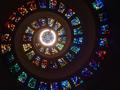
| 01/29/2003 04:31:37 PM |
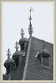
May The Light Shine On Youby goodtempoComment: Where is this I would like to visit it some day? The lights at the top are a little distracting but that can't be helped, I also like the way you off-centered the pic. this is far more pleasing than dead center. The old rule of thirds comes into play again. The architecture and color make the image, Good shot and good luck. John Gill |
| Photographer found comment helpful. |
| 01/29/2003 04:24:51 PM |
Eternal Doorwayby AnachroniteComment: The church is absolutely beautiful! The composition takes away from the overall image. One of the rules in art/photography is never have your point of interest end at the edge of the paper. In this case we should have seen just a little more above the apex of the entry way. Another hint I try to give my students is to never shoot straight at an object, even a slight angle will add more to the pictures creativity. Still a nice image and well taken. John Gill |
| Photographer found comment helpful. |
| 01/29/2003 04:17:26 PM |
Room With A Viewby GekkerComment: This is the type of pic. I like! Simplistic in nature, yet very creative. Thank you for not shooting it straight on, the slight angle really adds to the overall image. (9) John Gill |
| Photographer found comment helpful. |
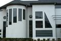
| 01/29/2003 04:12:25 PM |
All the Shapesby DennisFComment: Love the house! I feel the picture lacks the creativity that is need in a challenge like this to get the high marks we all strive for. If this is your house, I am impressed! (7) John Gill |
| Photographer found comment helpful. |
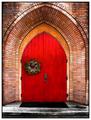
| 01/29/2003 04:04:49 PM |
Church Doorby jodiecostonComment: I really like the clarity and lighting of your subject, the wreath also works well, I like a point of interest that is different from the main topic. Great pic. (8) John Gill |
| Photographer found comment helpful. |
Home -
Challenges -
Community -
League -
Photos -
Cameras -
Lenses -
Learn -
Help -
Terms of Use -
Privacy -
Top ^
DPChallenge, and website content and design, Copyright © 2001-2025 Challenging Technologies, LLC.
All digital photo copyrights belong to the photographers and may not be used without permission.
Current Server Time: 04/09/2025 01:20:04 PM EDT.