| Image |
Comment |
| 02/13/2003 08:29:42 AM |
Boboby EisbaerComment: Welcome to the club. For your first digital image you did a great job. I like the close up and the composition of the picture. Placing the parrot over on the right side instead of the middle works very well. The cage on the left of the picture creates a nice pattern, I wouldn't change that at all. Two things could be changed that would help. If you toned down the light a little you would not have the glare on the beak. The other would be to use more than one light. The shaddow on the back wall is distracting. You could have used a back light to wipe that out or move the cage so the shaddow has nothing to rest on. Keep up the good work, I'll keep an eye out for future work. JG |
 Photographer found comment helpful. Photographer found comment helpful. |
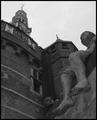
| 02/13/2003 05:28:54 AM |
Shipmates of Bontekoeby AzrifelComment: Great perspective and composition, lighting is dark and the light at the top of the building is distracting. Another time of day would have allowed for better lighting or some creative shadows. |
| Photographer found comment helpful. |
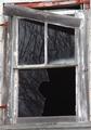
| 02/09/2003 04:22:51 PM |
Broken Reflectionsby KazComment: Nice all around image. The shapes and forms, reflections, contrasts, and especially the combination of textures really makes this a photo
of high quality. It's a shame the red in the upper half of the picture was not a little richer. that would have really set the photo off. The composition might be a little tight. I would have liked to have seen all of the hinges, but only you know if that would have worked or distracted from the image. I would like to see this done in black and white. Black and white phototgraphy is one of my passions and if you would not mind emailing me that image I would appreciate the effort. Thanks, John Gill |
| Photographer found comment helpful. |
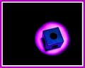
| 02/07/2003 06:02:47 AM |
Meet Spot, my pet square.by SonifoComment: I found how you created your image as interesting as the image it self. Bonus point for creativity. Your colors work well together and placing the image in the "hot spot" of the rule of thirds also works well. The simplicity of the object as well as the simplicity of the background makes for a dynamic image. Shooting the image at an angle instead of straight down shows you have an eye for the creative. As is, a (7). When working with my students I always try to have them experiment with their image. I have no idea if this would have worked in your favor or not, but did you try and do the image in black and white. Because of the simplicity of the object and background I think the simplicity of black and white would have added to the overall picture. This is just an opinion, try it and see if you like the image better. Then let me know. Keep up the good work. John Gill |
| Photographer found comment helpful. |
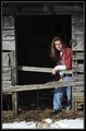
| 02/04/2003 10:45:51 AM |
Little Sisterby karmatComment: Using the images you have choosen I see three possible ways to present this picture. 1, To have a posed picture exactly like you did. You see this type of image in many advertisements. 2, Have a more candid shot where your sister is not looking directly into the camera. 3. Move your sister into the dark area where she is just visible, perhaps the light just hitting her face, this would add mystery to the image. I prefer the candid shot or the mystery shot in challenges like this. Where your image works great in the family album, or as an advertizement for cloths. The colors are vibrant, the image is sharp and the composition is good. Keep up the good work and good luck on your current challenges. john gill |
| Photographer found comment helpful. |
| 02/03/2003 07:26:10 AM |
Coal to Diamondby karmatComment: Clever idea and the contrast works well. Lighting also enhances the picture. |
| Photographer found comment helpful. |
| 02/03/2003 07:22:12 AM |
|
| Photographer found comment helpful. |
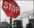
| 01/30/2003 04:07:24 PM |
signs of the timesby tomzinhoComment: Good perspective, nice sharp image, the colors don't seem to work together which is nothing you can control. You will notice most of the reds are at the bottom left and the yellow sign is in the top right. These two dominating colors are fighting for the viewers eye, which in my opinion cause a distraction to an otherwise great angle and composition. JG |
| Photographer found comment helpful. |
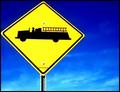
| 01/30/2003 04:01:23 PM |
The Fire Engine Signby AnnidaComment: The composition, and color make it a very striking image. Perhaps a little blood...just kidding. The point of view also helps the image...The low score???? I can only guess that it was because the image is very flat and gives little depth of field. Perhaps a catchier title might have helped. Although a 5.8 isn't that bad of score. Good luck on your next challenges. JG |
| Photographer found comment helpful. |
| 01/30/2003 03:55:16 PM |
the Madnessby moondoggieComment: The image says it all!!! No title was necessary. I liked the idea that you incorporated your sign with the back ground image. Advanced thinking skills. The color of the sign and the black background and image works absolutely great together. I am shocked you did not score higher.The cropping everything works. No less than a (9) from this judge. JG |
| Photographer found comment helpful. |
Home -
Challenges -
Community -
League -
Photos -
Cameras -
Lenses -
Learn -
Help -
Terms of Use -
Privacy -
Top ^
DPChallenge, and website content and design, Copyright © 2001-2025 Challenging Technologies, LLC.
All digital photo copyrights belong to the photographers and may not be used without permission.
Current Server Time: 04/09/2025 01:23:48 PM EDT.