| Author | Thread |
|
|
02/03/2003 09:03:35 PM |
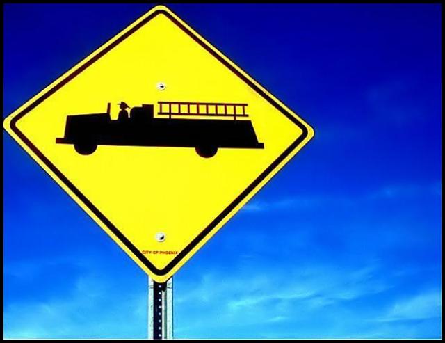
HEY! I gave this an 8. I love the colors. Biggest complaint is that it goes off the left side of the frame. I like that it isnt centered but it should all be inside the shot. It's a cute sign. Very simple shot but it works for me. Yellow & Blue are Sweden's colors and my bf is swedish so ... :D
Use the full file size!! There's no reason not to, and make sure that you don't repeatedly save as jpg or you will get more artifacting b/c it loses info every time you save. Save as something else until you're all done editing. (you might know that but anyway) |
|
 Photographer found comment helpful. Photographer found comment helpful. |
|
|
01/30/2003 09:01:23 PM |
| The composition, and color make it a very striking image. Perhaps a little blood...just kidding. The point of view also helps the image...The low score???? I can only guess that it was because the image is very flat and gives little depth of field. Perhaps a catchier title might have helped. Although a 5.8 isn't that bad of score. Good luck on your next challenges. JG |
|
| Photographer found comment helpful. |
|
|
01/27/2003 05:46:41 PM |
I can't believe this came in at 42nd. Great shot.
Message edited by author 2003-01-27 17:53:14. |
|
| Photographer found comment helpful. |
|
|
01/27/2003 09:01:12 AM |
It's amazing. I couldn't see all the artifacting on my other computer! I'm on the laptop now, and it's so evident... maybe I should check on both from now on :p
Thank you for your helpful comments everybody :) |
|
|
|
01/27/2003 08:31:50 AM |
Originally posted by magnetic9999:
was one of my faves. unique sign. great results with that camera too! |
It's true! She discovered Neatimage and how to use the levels adjustment in the Gimp while processing this photo (from conversations with me and puppet10). I'm so proud... and jealous! :P |
|
| Photographer found comment helpful. |
|
|
01/27/2003 07:58:38 AM |
| was one of my faves. unique sign. great results with that camera too! |
|
| Photographer found comment helpful. |
|
|
01/27/2003 12:07:28 AM |
Nice finish! :P Not too shabby at all. I concede to you or great one.
Jason |
|
| Photographer found comment helpful. |
Comments Made During the Challenge  |
|
|
01/26/2003 11:39:52 PM |
| Wonderful contrasting colors...good clear focus. Nice! |
|
| Photographer found comment helpful. |
|
|
01/26/2003 12:01:04 PM |
| Great framing. Awesome color. Subject is not terribly appealing but the quality of this photo is. Great shot. - Inspzil |
|
| Photographer found comment helpful. |
|
|
01/25/2003 08:36:09 PM |
| This is Cute. Nice Colors. |
|
| Photographer found comment helpful. |
|
|
01/25/2003 12:02:04 PM |
| cropped just a little too close. would have liked to see a bit of the vibrant blue to the left and top of sign. |
|
| Photographer found comment helpful. |
|
|
01/24/2003 09:42:14 PM |
| Very nice colour saturation. I don't understand the placement of the sign, seems too close to the bordres. Might have worked better in portrait mode and centered. Still a beautifull photo because of the colours. 8 Jacko. . |
|
| Photographer found comment helpful. |
|
|
01/24/2003 11:33:06 AM |
| Awesome graphic composition and saturated colors. Nice work. |
|
| Photographer found comment helpful. |
|
|
01/24/2003 02:58:20 AM |
| Lovely strong colours. Maybe it's a little too tightly cropped to the left and top of the sign. |
|
| Photographer found comment helpful. |
|
|
01/23/2003 08:29:28 AM |
| What a nice contrast between blue and yellow. Those colors are really crisp! |
|
| Photographer found comment helpful. |
|
|
01/22/2003 11:03:23 PM |
| beautiful sky in the background. I wish the sign was more centered |
|
| Photographer found comment helpful. |
|
|
01/22/2003 12:48:51 PM |
| You can't get more contrasting colours than this. Well done. |
|
| Photographer found comment helpful. |
|
|
01/22/2003 12:11:02 PM |
that blue really works well with the bright yellow, it isn't a very interesting sign, and i think it would have been better with less of the post in the picture
|
|
| Photographer found comment helpful. |
|
|
01/21/2003 05:21:17 PM |
| Simple and sweet. The sky color is killer. :) |
|
| Photographer found comment helpful. |
|
|
01/20/2003 10:59:56 PM |
| Good job in picking complimentary colours. I think you compressed it a bit too much though. |
|
| Photographer found comment helpful. |
|
|
01/20/2003 08:08:52 PM |
| Good picture. Just a smidgen of blue on the left edge might have improved it. 7 |
|
| Photographer found comment helpful. |
|
|
01/20/2003 07:02:41 PM |
| The should make them red...ours are yellow too. Beautiful sky. Nice work. |
|
| Photographer found comment helpful. |
|
|
01/20/2003 04:56:02 PM |
| This is a nice photo but is there jpeg artifacts around the sign? Maybe increase the quality a little? |
|
| Photographer found comment helpful. |
|
|
01/20/2003 04:12:13 PM |
| Great colors, but it seems a little blurry to me. |
|
| Photographer found comment helpful. |
|
|
01/20/2003 03:35:06 PM |
| Once again, love the contrast..nice pic |
|
| Photographer found comment helpful. |
|
|
01/20/2003 02:46:47 PM |
| Got to love that Arizona sky ... |
|
| Photographer found comment helpful. |
|
|
01/20/2003 10:28:32 AM |
| Nice composition!!! Nice sky!!! I wish I was in Phoenix!!! |
|
| Photographer found comment helpful. |
|
|
01/20/2003 10:05:37 AM |
| i like how the detail is so strong that i can read the city in the small type, but at least on my screen there seems to be some contrast problems along the edge of the sign vs. the sky, esp. on the upper side. |
|
| Photographer found comment helpful. |
|
|
01/20/2003 09:06:53 AM |
| some artifacting around the sign, but great colors. |
|
| Photographer found comment helpful. |
|
|
01/20/2003 01:36:16 AM |
| Excellent color in this one. I like the composition quite a bit. My only criticism would be the jpeg compression is very evident here, as the image is only 30k, and you are allowed 150k. 6 |
|
| Photographer found comment helpful. |
|
|
01/20/2003 12:25:51 AM |
| i love the sign against the blue sky |
|
| Photographer found comment helpful. |
Home -
Challenges -
Community -
League -
Photos -
Cameras -
Lenses -
Learn -
Help -
Terms of Use -
Privacy -
Top ^
DPChallenge, and website content and design, Copyright © 2001-2026 Challenging Technologies, LLC.
All digital photo copyrights belong to the photographers and may not be used without permission.
Current Server Time: 02/01/2026 07:21:42 AM EST.