| Image |
Comment |
| 07/04/2006 09:30:41 AM |
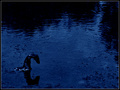
In Search of the Loch Ness Monsterby RikkiComment: Technical: Focus - 1
Exposure- 1
Quality - 1
Aesthetic: Comp. - 1
Light - 1
Color - 1
Wow factor: 1
Personal tilt: 3/3
What I like: The monotone blues work well. The dark composition and the texture of the water are great.
What I didn't like: Can't think of anything really. I really like this picture. |
 Photographer found comment helpful. Photographer found comment helpful. |
| 07/04/2006 09:28:56 AM |
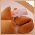
Fortune Cookiesby sfarrell23Comment: Technical: Focus - 1
Exposure- 1
Quality - 1
Aesthetic: Comp. - 1
Light - 1
Color - 1
Wow factor: 0
Personal tilt: 1/3
What I like: The image is very well done, technically.
What I didn't like: maybe the image is too warm? I have a hard time connecting to the picture. It's not a bad picture, it just doesn't move me. It could also be the lack of any specific message. |
| Photographer found comment helpful. |
| 07/04/2006 09:25:03 AM |
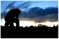
Pie In The Skyby LERtasticComment: Technical: Focus - 1
Exposure- 1
Quality - 1
Aesthetic: Comp. - 1
Light - 1
Color - 1
Wow factor: 0
Personal tilt: 3/3
What I like: Great silhouette picture. I like the detail and color in the sky - good DOF.
What I didn't like: I guess I could say the street lamp... It's pretty hard to pick anything specifically. I feel like you were trying to express just a little bit more in the image than I'm getting from it, and that's probably my fault. |
| Photographer found comment helpful. |
| 07/04/2006 09:20:46 AM |
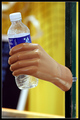
Beware of strangers bearing giftsby BradComment: Technical: Focus - 1
Exposure- 1
Quality - 1
Aesthetic: Comp. - 0
Light - 1
Color - 1
Wow factor: 0
Personal tilt: 1/3
What I like: Complimentary colors are always good.
What I didn't like: Why was a fake hand used? |
| Photographer found comment helpful. |
| 07/04/2006 09:18:42 AM |
Don't Step On A Crackby bobgaitherComment: Technical: Focus - 1
Exposure- 1
Quality - 0
Aesthetic: Comp. - 0
Light - 1
Color - 1
Wow factor: 0
Personal tilt: 2/3
What I like: It's the most humorous crack picture.
What I didn't like: The image quality seems a little bit degraded for some reason. Shallower DOF might have helped. |
| Photographer found comment helpful. |
| 07/04/2006 09:15:35 AM |
It's bad luck to pick up a coin if it's tails side up.by ReveccaComment: Technical: Focus - 1
Exposure- 1
Quality - 1
Aesthetic: Comp. - 1
Light - 1
Color - 1
Wow factor: 1 for putting a very simplistic yet punchy picture together in a square frame.
Personal tilt: 2/3
What I like: The punch of the coin in the image is pleasant. I like the braclet on the wrist. The B&W works well. Square frame/composition looks great.
What I didn't like: I'm being picky, but the title is really long with a ton of small words in it. |
| Photographer found comment helpful. |
| 07/04/2006 09:11:50 AM |
Step On A Crack, Break Your Mother's Backby rubienneComment: Technical: Focus - 1
Exposure- 1
Quality - 1
Aesthetic: Comp. - 1
Light - 1
Color - 1
Wow factor: 0
Personal tilt: 1/3
What I like: The best crack picture in the competition IMO. I like the close POV and the muted color.
What I didn't like: I'm not that keen on crack pictures. There ended up being a bunch of them in the competition. |
| Photographer found comment helpful. |
| 07/04/2006 09:05:45 AM |
Myth: Man can fly.by JadeComment: Technical: Focus - 1
Exposure- 1
Quality - 1
Aesthetic: Comp. - 1
Light - 0
Color - 1
Wow factor: 0
Personal tilt: 2/3
What I like: I like the idea of the image and the graniness in the execution. I think the grain adds to the effect of the image.
What I didn't like: I took a point off for light because the image lacks a 'punch' in my opinion. I know you couldn't control the light and I'm not sure if that point should have been taken for exposure instead. Perhaps the image is too dark? |
| Photographer found comment helpful. |
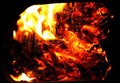
| 07/04/2006 08:56:40 AM |
The Devil In the Flames (Look Closely)by jusdino4itComment: Technical: Focus - 1
Exposure- 1
Quality - 1
Aesthetic: Comp. - 1
Light - 1
Color - 1
Wow factor: 1 very cool
Personal tilt: 2/3
What I like: Cool effect. Nice job, however you did it!
What I didn't like: Could have been clearer. Hey! I know you probably couldn't do anything about it, but still, people wouldn't have a clue without you trying to get them to spend some time looking for it. |
| Photographer found comment helpful. |
| 07/04/2006 08:50:38 AM |
Find a penny, pick it up and all day long you'll have good luckby owittComment: Technical: Focus - 0 seem a bit soft to me
Exposure- 1
Quality - 1
Aesthetic: Comp. - 1
Light - 1
Color - 1
Wow factor: 0
Personal tilt: 2/3
What I like: I like the nice clean penny and the green texture around it works well.
What I didn't like: Focus seems a tat soft to me. The light on the penny is a little harsh. |
| Photographer found comment helpful. |
Home -
Challenges -
Community -
League -
Photos -
Cameras -
Lenses -
Learn -
Help -
Terms of Use -
Privacy -
Top ^
DPChallenge, and website content and design, Copyright © 2001-2025 Challenging Technologies, LLC.
All digital photo copyrights belong to the photographers and may not be used without permission.
Current Server Time: 04/16/2025 12:26:30 AM EDT.