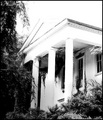
DPChallenge: A Digital Photography Contest You are not logged in. (log in or register
 
Browse Settings
Currently viewing:
Registered UserLouisa

Show comments:

Per page:

Order:

Comments:


Comments Made by Louisa
Pages:   ... ...
Showing 121 - 130 of ~496
Image Comment
    "Oops.  This is a bit embarassing."
10/15/2008 12:22:18 PM
"Oops. This is a bit embarassing."
by Lydia

Comment:
I love the composition & crop on this shot. 8
Photographer found comment helpful.
Too Much Candy
10/15/2008 05:15:41 AM
Too Much Candy
by VitaminB

Comment:
I was hoping someone would pull this off. =)
Photographer found comment helpful.
The Inside's Out.
10/15/2008 04:57:13 AM
The Inside's Out.
by PeteT

Comment:
Cute idea, but the image is really dark.
Photographer found comment helpful.
Life Saver
09/17/2008 06:07:56 AM
Life Saver
by Cuttooth

Comment:
Great texture
Photographer found comment helpful.
There is safety in her smile.
09/17/2008 06:00:07 AM
There is safety in her smile.
by CassieDoodle

Comment:
Cute shot.. but I think it's a stretch for the challenge.
Photographer found comment helpful.
Fear of heights
09/17/2008 05:39:40 AM
Fear of heights
by jettyimages

Comment:
Not sure what I'm looking at.
Photographer found comment helpful.
Emma
09/16/2008 12:05:11 PM
Emma
by CassieDoodle

Comment:
Greetings from the Critique Club!

Well first of all, this is an absolutely adorable shot. The expression on her face is priceless.

Colors: I agree with the comment about the overexposure brining out her eyes. Wonder if bumping up the blue saturation would make them stand out a little more? I love the red dress. Works well with the greens in the background, and stands out from her pale skin.

Lighting: Some comments say you didn̢۪t overexpose enough. I disagree. I think if you went too much more, you̢۪d lose the detail in her expression, and possibly lose sight of her hair.

Framing: Good job framing / cropping as well. Good use of the rule of thirds.

Critiques: One of the first things I noticed was the lines on her head. Almost looked like a painting on canvas. It̢۪s not a deal breaker, but it is a little distracting. Also, I think I̢۪d prefer it without the thread / grass on her dress. I realize this was more of an impromptu shot, so it̢۪s not a big deal.

Overall, you captured a great moment, and it met the challenge well. I think voters may have skipped by this photo too quickly to enjoy all of the subtleties of the shot.
Photographer found comment helpful.
Overgrown Manse
09/16/2008 07:58:24 AM
Overgrown Manse
by NikonJeb

Comment:
Greetings from the Critique Club!

This shot instantly reminded me of the Haunted Mansion at Disneyland. I think you chose great subject to overexpose.

I like the angle you used for this shot. It gives the house a grandiose presence, and captures the plant growth that has invaded. I particularly like the plants that seem to be bursting through the ceiling on the porch. The delicate branch reaching towards the house on the left is great too. It brings some good detail and life to the mess of foliage.

A couple of my favorite elements of this shot are the lines along the top of the roof, and around the roof trim. The subtle line outlining the very top is excellent. Without this, I may have thought it was too overexposed. The shadows and contrast in the trim also bring some nice detail to the shot – and a perfect place too, since my eyes are drawn to that corner.

I wasn̢۪t so sure about the hanging leaves on the upper left at first. I thought they seemed too out of focus, and looked almost like a painting. However, the more I look at the shot, the more I like them. They really add to the mood. The plants at the bottom are also well lit, without being overexposed. You left the overexposed-ness to the main subject of the shot, the house. Well done.

I also think you made the right choice by going black & white. My only suggestion for improvement may have been to bring a tad more detail out of the right column. It̢۪s not really necessary though. And I̢۪m not sure how̢۪d you manage it.

Overall, a great shot. The more I look at it, the more I like it. IMO, your score should have been closer to the 7-8 range.
Photographer found comment helpful.
Orquidea de Phalaenopsis
08/22/2008 01:02:20 PM
Orquidea de Phalaenopsis
by EBJones

Comment:
Nice shot. I like the composition.
Photographer found comment helpful.
Stopover
08/22/2008 01:00:15 PM
Stopover
by Eisbaer

Comment:
Great perspective
Photographer found comment helpful.
Pages:   ... ...
Showing 121 - 130 of ~496


Home - Challenges - Community - League - Photos - Cameras - Lenses - Learn - Help - Terms of Use - Privacy - Top ^
DPChallenge, and website content and design, Copyright © 2001-2025 Challenging Technologies, LLC.
All digital photo copyrights belong to the photographers and may not be used without permission.
Current Server Time: 04/08/2025 07:50:52 AM EDT.