| Image |
Comment |
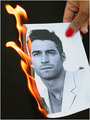
| 04/24/2006 09:54:01 AM |
Window of Faithby angela_packardComment: Needs to be rotated slightly counterclockwise, but beautiful. I had this idea myself and passed on it for lack of time. |
 Photographer found comment helpful. Photographer found comment helpful. |
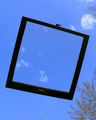
| 04/24/2006 09:24:09 AM |
Clouded Windowby KenComment: Because there are clouds outside the window frame, it seems more a picture of a window than of a window framing something. I am also distracted by the trees, particularly along the bottom edge where they could (and should) have been very easily cropped out. |
| Photographer found comment helpful. |
| 04/21/2006 06:27:14 PM |
The Great Oakby Fellow EskimoComment: Now this is how to do "old" in a nature shot! There have been a lot of so-so landscapes of questionable theme suitability in this challenge.. but this tree looks like a bent old man and is actually fairly well shot. Not a ten, but it should still make you proud. |
| Photographer found comment helpful. |
| 04/21/2006 05:23:40 PM |
|
| Photographer found comment helpful. |
| 04/21/2006 05:22:21 PM |
|
| Photographer found comment helpful. |
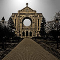
| 04/21/2006 05:20:26 PM |
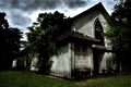
Basillicaby ronnytComment: This would work better if the building were more centered. The building isn't tilted, but I think the off-centeredness of it makes it look like it's leaning to the right. It's a weird optical illusion. |
| Photographer found comment helpful. |
| 04/21/2006 05:15:10 PM |
|
| Photographer found comment helpful. |
| 04/21/2006 05:13:20 PM |
solitudeby riderComment: Needs to be sharper, more color saturation. |
| Photographer found comment helpful. |
| 04/21/2006 05:10:17 PM |
|
| Photographer found comment helpful. |
| 04/21/2006 05:06:43 PM |
Earth Moverby holdingtimeComment: The perspective here is just odd. The weighting is disconcerting. The wheels should be anchored to the bottom of the picture. Remember that the bottom of a picture is almost always perceived to be the ground, the front, closer, etc. Anything that looms large in the top of the frame looks like it's flying and that just doesn't work in this photo's favor. I'd also like to see more of the object you're shooting and less of its rock stage. |
| Photographer found comment helpful. |
Home -
Challenges -
Community -
League -
Photos -
Cameras -
Lenses -
Learn -
Help -
Terms of Use -
Privacy -
Top ^
DPChallenge, and website content and design, Copyright © 2001-2025 Challenging Technologies, LLC.
All digital photo copyrights belong to the photographers and may not be used without permission.
Current Server Time: 04/07/2025 10:12:34 PM EDT.