| Image |
Comment |
| 06/05/2006 03:53:47 PM |
|
 Photographer found comment helpful. Photographer found comment helpful. |
| 06/05/2006 10:35:04 AM |
Yurpleby igniteComment: Wow, what a cool shot. Definitely was true to the challenge, and I think it is a shame that it didnt do better. I like the fact that you rotated the shot, because it gives it the appearance of smoke or something. Great idea! |
| Photographer found comment helpful. |
| 06/05/2006 10:32:14 AM |
Lost in Timeby kirbicComment: Wow, I always love going back and looking at people's earlier work. You have truely come a long way since the beginning. This shot is pretty true to the challenge, but as time passes... hahah.. it sure puts things into perspective :P |
| Photographer found comment helpful. |
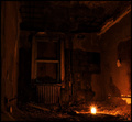
| 06/05/2006 03:26:40 AM |
Hopeby dahkotaComment: Wow! This is a powerful image. I really like it a lot. The lightsource is really cool, and i love what it does to the shadows in this gritty room. I think this is going in my favs :D |
| Photographer found comment helpful. |
| 06/05/2006 03:25:02 AM |
by fotomann_foreverComment: This might have been taken in an empty room, but it has more of a studio feel to it, and doesnt really convey the theme. I like the soft focus you used in this portrait though. |
| Photographer found comment helpful. |
| 06/05/2006 03:23:16 AM |
|
| Photographer found comment helpful. |
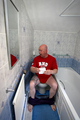
| 06/05/2006 03:22:27 AM |
After Settlement...by bgableComment: I like your use of DOF here. The image is way to small though, and the subject is not in full focus. Did you use a tripod? I think in this image it is very important for us to be able to see the bottle clearly.
Just a pointer for getting your score up: There are some instructions on how to size the photo in the tutorials section under the "learn" tab, that really helped me out. I believe the tut. is called "preparing your image for dpc" Good luck :-) |
| Photographer found comment helpful. |
| 06/05/2006 03:17:44 AM |
The Dunce Capby LERtasticComment: Nice idea. The crop kinda bothers me though. I would like to see some more of the room. Maybe a corner or something? 7 |
| Photographer found comment helpful. |
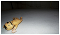
| 06/05/2006 03:14:04 AM |
Dollhouseby LouisComment: I like the doll, and the composition of the photo here. I find the background a little boring though. Perhaps you could have added to the empty room feel, by showing some walls to difine the confinement. Cool concept though. |
| Photographer found comment helpful. |
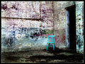
| 06/05/2006 03:11:26 AM |
Blue Chairby sherComment: Love the use of colors here. I like the gritty look too. I think the title could have been a little bit more creative though :P. I just realized what i like most of this photo is that all the lines point to the subject, including the corner of the missing billboard on the top left. |
| Photographer found comment helpful. |
Home -
Challenges -
Community -
League -
Photos -
Cameras -
Lenses -
Learn -
Help -
Terms of Use -
Privacy -
Top ^
DPChallenge, and website content and design, Copyright © 2001-2025 Challenging Technologies, LLC.
All digital photo copyrights belong to the photographers and may not be used without permission.
Current Server Time: 04/07/2025 10:03:23 PM EDT.