| Image |
Comment |
| 05/06/2003 11:49:47 AM |
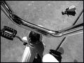
Hitching a Rideby PaigeComment: This would make a great jones soda lable (//www.jonessoda.com) I love the angle in this shot. very cool perspective. |
 Photographer found comment helpful. Photographer found comment helpful. |
| 05/04/2003 09:26:31 PM |
Main Gateby rickhd13Comment: This seems like the brightness was increased a bit too much. I like the shot though and the text fits along great. It'd have been really neat on a windy day with the flags blowing. Overall this would be a great postcard, meets the challenge wonderfully, well done. |
| Photographer found comment helpful. |
| 05/04/2003 09:08:41 PM |
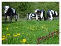
Milton Keynes - Home of the Concrete Cowsby pinbackComment: Concrete cows I can't help but to snicker. The picture looks good I like the angle I like the depth of field. The text seems a bit out of place in that color, something a little more mild might have been a bit more itting. Overall well done! these are the finest looking concrete cows I've ever seen photographed |
| Photographer found comment helpful. |
| 05/04/2003 09:07:20 PM |
For Mother's Dayby myqylComment: the lighting seems a bit weak in this shot. The buildings are too dull in my opinion, where they should be the primary points of focus for this shot. |
| Photographer found comment helpful. |
| 05/04/2003 09:06:30 PM |
Fargo, North Dakotaby alanfreedComment: I like hte use of a slogan, very fitting to a postcard. The picture looks great. overall well done. Exactly what I'd expect in a postcard from Fargo, North Dakota. |
| Photographer found comment helpful. |
| 05/04/2003 09:05:15 PM |
Jefferson Memorialby magnetic9999Comment: I like the text in this one, very fitting. A border might have given it a slightly more postcard feel but even without one it holds its own. Wonderful angle and great picture. The setting sun gave great lighting colors, well done. |
| Photographer found comment helpful. |
| 05/04/2003 09:02:46 PM |
Baltimore Inner Harborby GolferDDSComment: The text on this might have looked better in either the top left or top right corner instead of dead center. The image is nice, but not too many details can be made out. it does have that postcard feel to it though. The blue border seems slightly out of place a white one might have been better. Overall not bad. |
| Photographer found comment helpful. |
| 05/04/2003 09:01:40 PM |
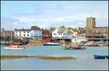
Shoreham-By-Seaby marboComment: The reds seem to be very oersaturated here. The image is nice in perspective, but the colors and details seem off. The border is nice nad this shot could make a good postcard, but the color is too saturated. |
| Photographer found comment helpful. |
| 05/04/2003 09:00:09 PM |
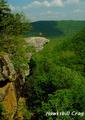
Hawksbill Crag Upper Buffalo National River Wilderness Areaby kandyjComment: THe contrast on this picture seems a bit to high to me. The Greens are so green, yet somehow the blues aren't very blue. The shot itself is really nice I like the perspective here a great deal. The white text doesn't seem to fit very well, I'm not sure what I would do to make that look better. Overall this would be a decent postcard. Good job. |
| Photographer found comment helpful. |
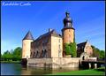
| 05/04/2003 08:58:53 PM |
Raesfelder Castleby kiwinessComment: the text feels fairly out of place in this one. a different color might have worked better, or maybe just a lighter border to offset it a bit. The image itself looks fabulout though the green looks a tad bit too bright. Overall this fits the challenge wonderful. Good job. |
| Photographer found comment helpful. |
Home -
Challenges -
Community -
League -
Photos -
Cameras -
Lenses -
Learn -
Help -
Terms of Use -
Privacy -
Top ^
DPChallenge, and website content and design, Copyright © 2001-2025 Challenging Technologies, LLC.
All digital photo copyrights belong to the photographers and may not be used without permission.
Current Server Time: 04/09/2025 05:31:39 AM EDT.