DPChallenge: A Digital Photography Contest You are not logged in. (log in or register
 
Browse Settings
Currently viewing:
Registered Usermarklovell

Show comments:

Per page:

Order:

Comments:


Comments Made by marklovell
Pages:   ...
Showing 1 - 10 of ~138
Image Comment
A Family's Moment Alone
07/05/2009 03:28:58 PM
A Family's Moment Alone
by brianlh

Comment:
::: Critique Club :::

First Impression:
A nice shot, but it feels a little strained.

Focus/DoF:
Seems spot on. I would have gone for a smaller aperture, but it doesn't bother me that it's not sharp in the foreground and background.

Colour:
Feels to me as though it could do with a little more punch, but it is quite calm the way it is, and I am assuming that was the look you were going for.

Composition:
I like the lines of the steps. They flow nicely.
The family, for my preference are too small, and are too near the corner of the picture. There is also a block up right of them that is distracting. I can understand that there is little you could do about that with regard to other people sat in the way, but I might perhaps at that point have not put them in the frame at all.
There is also a small white fleck (a tissue?) on the nearest curve of steps that is quite distracting.

I like the angle of the lighting, and I like the way the small steps intrude into the flow of the larger curves, without destroying the lines.

I good shot, and well done. Overall, I really like it.

-------------------------------------------------------------

It is my hope that these insights are helpful, and constructive. If you have any questions regarding this critique, please feel free to PM me. Also feel free to PM me with any feedback on this critique. And please remember to mark it "Helpful" if you found it so.

Mark
Photographer found comment helpful.
Stranger in a strange land
07/05/2009 02:10:01 PM
Stranger in a strange land
by RulerZigzag

Comment:
::: Critique Club :::

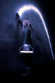
First Impressions: Interesting, and busy photo. Looks good in B&W.

-------------------------------------------------------------

Composition:
Is pretty good. I am bothered by the return of the nearest handrail - that it is not parallel to the bottom of the picture, and personally it feels as though the very bottom of the shot has been cropped a little short. There is obviously no horizon as such in this photo, but as both of the wall/ground lines are in perspective, you might get away with making the return of the handrail your perspective line?
My eye is drawn into the lower right section - where the guy is, but I am more distracted by the shadow on the wall to his left (perhaps this is because I work in theatre and it's my job to notice that sort of thing...)


Technical (Colour, focus, and light):
I am struggling a little to find the exact focus point, but I think it's just the camera side of the guy (who to me feels like he should be the focus point of the photo). Putting it on him would help to put the handrail out of focus more and then it would probably bug me less.
I like the light falling on the front of the guy, and I like the glow on the underside of the saucer.

I am wondering whether a lower viewpoint might allow you to remove the 'Cosi' signs from the background (by hiding them behind the saucer). Whilst I realise it's a city shot, as the only unrelated signs in the photo they're a bit distracting and look a little out of place.

I like this in B&W and I don't think it would have anywhere near as much impact in colour.
-------------------------------------------------------------

Summary: An interesting capture. I like the light bouncing off the guy, but I think your viewpoint is either too high or far too low.

-------------------------------------------------------------

It is my hope that these insights are helpful, and constructive. If you have any questions regarding this critique, please feel free to PM me. Also feel free to PM me with any feedback on this critique. And please remember to mark it "Helpful" if you found it so.

- Mark
Photographer found comment helpful.
Chatting Up The Cops
05/29/2006 01:57:10 PM
Chatting Up The Cops
by gsal

Comment:
First Impression:

A nice candid, although you seem to have been a little high when you took the photo.

Lighting:

The contrast seems quite high - have you bumped it any? There is almost some burnout upper right and in the door, and the pavement is quite dark. Being a candid though, there's very little you could have done about that...

Focus/DoF:

Seems spot on. It's a candid - you want most of it in focus anyway.

Colour:

Feels to me as though it could do with some more punch, almost as though the exposure has washed it out, but it could just be the high contrast and my monitor.

Composition:

I would have preferred a closer crop I think. And whilst I generally like the border, I'm not keen on the black up left next to the frame. It detracts from the impact of the border. A closer crop would have avoided that. But the distance is a tough call, and a personal choice. You don't want to show too little of the surroundings to tell the story.

Mark
Photographer found comment helpful.
Doomsday Power Conspiracy
05/22/2006 03:16:53 PM
Doomsday Power Conspiracy3rd Place
by Tallbloke

Comment:
ERROR: Tallbloke is already in your favorites list.
Photographer found comment helpful.
Industrial, Light and Magic
03/01/2006 02:29:49 PM
Industrial, Light and Magic
by Tallbloke

Comment:
Wait a minute... that looks familiar!

Shame the bucket couldn't have been sharper, apart from that my only real nitpick is the halp around the model's body.

Nice shot. Hope you do well.
Photographer found comment helpful.
Buachaille Etive Mor
02/28/2006 11:23:49 PM
Buachaille Etive Mor
by Tallbloke

Comment:
Congrats Steve.

Looks like I'll have to get out there sometime...
Photographer found comment helpful.
roadweb.jpg
02/26/2006 04:38:31 AM
roadweb.jpg
by deapee

Comment:
Lovely colours and great exposure.

Compositionally it's lacking some foreground interest. Maybe if you were nearer the road surface?
Photographer found comment helpful.
Love Ever Grows
02/18/2006 05:22:09 PM
Love Ever Grows
by ladyhawk22

Comment:
I really like the heart in the rose. Did you manipulate the petals or was that luck/choice?

Good exposure, nice composition.

Hope this does well for you.

Mark
Photographer found comment helpful.
Close to my heart
02/18/2006 05:11:40 PM
Close to my heart
by ArnarH

Comment:
Wonderful textures and tones!
Hope you do well.
Photographer found comment helpful.
The Book of Love
02/18/2006 05:10:58 PM
The Book of Love
by gloda

Comment:
Seen this technique before - and i still like it. Like the colours and the exposure is perfect. There are some highlight lines on the background which I find a little distracting. All in all, a cracking shot.
Photographer found comment helpful.
Pages:   ...
Showing 1 - 10 of ~138


Home - Challenges - Community - League - Photos - Cameras - Lenses - Learn - Help - Terms of Use - Privacy - Top ^
DPChallenge, and website content and design, Copyright © 2001-2025 Challenging Technologies, LLC.
All digital photo copyrights belong to the photographers and may not be used without permission.
Current Server Time: 04/07/2025 08:56:29 AM EDT.