| Author | Thread |
|
|
07/05/2009 02:10:01 PM |
::: Critique Club :::
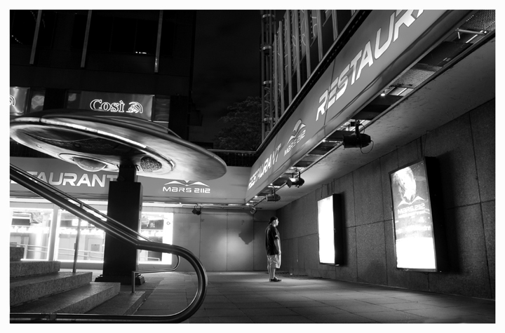
First Impressions: Interesting, and busy photo. Looks good in B&W.
-------------------------------------------------------------
Composition:
Is pretty good. I am bothered by the return of the nearest handrail - that it is not parallel to the bottom of the picture, and personally it feels as though the very bottom of the shot has been cropped a little short. There is obviously no horizon as such in this photo, but as both of the wall/ground lines are in perspective, you might get away with making the return of the handrail your perspective line?
My eye is drawn into the lower right section - where the guy is, but I am more distracted by the shadow on the wall to his left (perhaps this is because I work in theatre and it's my job to notice that sort of thing...)
Technical (Colour, focus, and light):
I am struggling a little to find the exact focus point, but I think it's just the camera side of the guy (who to me feels like he should be the focus point of the photo). Putting it on him would help to put the handrail out of focus more and then it would probably bug me less.
I like the light falling on the front of the guy, and I like the glow on the underside of the saucer.
I am wondering whether a lower viewpoint might allow you to remove the 'Cosi' signs from the background (by hiding them behind the saucer). Whilst I realise it's a city shot, as the only unrelated signs in the photo they're a bit distracting and look a little out of place.
I like this in B&W and I don't think it would have anywhere near as much impact in colour.
-------------------------------------------------------------
Summary: An interesting capture. I like the light bouncing off the guy, but I think your viewpoint is either too high or far too low.
-------------------------------------------------------------
It is my hope that these insights are helpful, and constructive. If you have any questions regarding this critique, please feel free to PM me. Also feel free to PM me with any feedback on this critique. And please remember to mark it "Helpful" if you found it so.
- Mark |
|
 Photographer found comment helpful. Photographer found comment helpful. |
Comments Made During the Challenge  |
|
|
07/02/2009 11:13:15 AM |
| imo i would have darkend it. |
|
| Photographer found comment helpful. |
|
|
07/02/2009 09:17:24 AM |
| Ok, couldn't find it anywhere! Cool photo, nicely done, and, as far as I can tell, unique! |
|
| Photographer found comment helpful. |
|
|
06/30/2009 04:44:11 PM |
| seen this theme many a time before. Great lines in this image though |
|
| Photographer found comment helpful. |
|
|
06/27/2009 04:12:21 PM |
| That's how I felt in Vienna. I like this as a black and white with the bright lights. |
|
| Photographer found comment helpful. |
|
|
06/27/2009 12:25:44 PM |
|
| Photographer found comment helpful. |
|
|
06/27/2009 12:22:34 PM |
|
| Photographer found comment helpful. |
|
|
06/27/2009 11:39:54 AM |
| I like the stark lonliness here. (not voting) |
|
| Photographer found comment helpful. |
|
|
06/27/2009 09:17:42 AM |
| I love the tones and glow. The inclusion of someone looking at a poster afford the shot the personality it needed. |
|
| Photographer found comment helpful. |
|
|
06/27/2009 08:02:51 AM |
| not sure I really get this one...guess I'm a bone head... |
|
| Photographer found comment helpful. |
|
|
06/27/2009 06:54:50 AM |
| Good black & white photo. For me, I'm not "sold" on it being never seen. |
|
| Photographer found comment helpful. |
|
|
06/26/2009 06:58:18 PM |
| There is something very very welcoming about this scene. Makes me just wanna walk in. |
|
| Photographer found comment helpful. |
|
|
06/26/2009 02:45:50 PM |
comment only.
Another image that explains why I'm not voting. We have a well composed and exposed image that does convey a story and the title adds weight to the image however, what is the unique element here? The scene is unique to me but every image submitted to a challenge is unique, even if its a water drop and a gut in the street could also be considered cliche - a strong image and good luck! |
|
| Photographer found comment helpful. |
|
|
06/26/2009 12:34:35 PM |
| good exposure, good lines and framing. But this is not something never seen |
|
| Photographer found comment helpful. |
|
|
06/25/2009 11:54:32 PM |
|
| Photographer found comment helpful. |
|
|
06/25/2009 08:59:14 PM |
|
| Photographer found comment helpful. |
Home -
Challenges -
Community -
League -
Photos -
Cameras -
Lenses -
Learn -
Help -
Terms of Use -
Privacy -
Top ^
DPChallenge, and website content and design, Copyright © 2001-2025 Challenging Technologies, LLC.
All digital photo copyrights belong to the photographers and may not be used without permission.
Current Server Time: 04/07/2025 02:00:13 AM EDT.