| Image |
Comment |
| 10/29/2005 06:35:44 AM |
|
 Photographer found comment helpful. Photographer found comment helpful. |
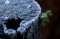
| 10/29/2005 06:34:23 AM |
Lichenby KaupsComment: Good choice of subject for this challenge, but it came out a bit dark and the piece of the tree dominates too much for my taste - especially the out of focus bright area in the foreground. The brightness is the problem to me on that not the focus. It just pulls me away from the lichen. I think a tighter crop and an angle that showed more detail in the lichen would have been better. |
| Photographer found comment helpful. |
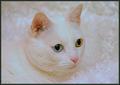
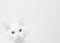
| 10/27/2005 07:39:18 AM |
It Is All In Her Eyesby KatmystiryComment: I would like just a little more contrast between the cat and the backgroud you have. As it is now the edges of the cat get lost in the background and I find that a bit disconcerting - just does not feel right. |
| Photographer found comment helpful. |
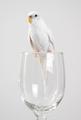
| 10/27/2005 07:37:24 AM |
Birdby SonifoComment: good image - I would move the glass/bird a dad to the right to get it out of the middle of the image. That would balance better with the bird looking to the left. |
| Photographer found comment helpful. |
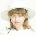
| 10/27/2005 07:33:46 AM |
Whiter Shades of Paleby secondglantzComment: A bit too much light on parts of her face - looks just a tad overexposed. It might have worked better to go with less exposure and bring out the whites with curves in the post processing. |
| Photographer found comment helpful. |
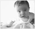
| 10/27/2005 07:30:02 AM |
How About Some Help?by vonautschComment: The in focus part of the image looks like it is on the chest, hands and arms rather than the face where it needs to be. |
| Photographer found comment helpful. |
| 10/27/2005 07:27:41 AM |
Stork whiteby BrennanOBComment: I would like to see more on the right and less on the left - as it is now I feel like I'm really looking at the right two thirds of the image. |
| Photographer found comment helpful. |
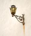
| 10/27/2005 02:54:48 AM |
Lit Light on Whiteby GermaineComment: Try moving the fixtrue down in the image - as it is now I end up feeling like I'm drawn out of the top of the mage. I would crop at the bottom and add more at the top to keep the same dimension for the image - if it can be done. |
| Photographer found comment helpful. |
| 10/27/2005 02:52:42 AM |
Untitledby LedZeppelin588Comment: I would like a bit more contrast to shwo the face better - also the line behind the cat's head is a real distraction. |
| Photographer found comment helpful. |
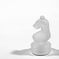
| 10/27/2005 02:46:02 AM |
White Knightby dw_photoComment: While I know you did it to light the piece better, I don't care a lot for the double shadow. A softer light migh have worked better for me - or more overhead light to kill the shadows. |
| Photographer found comment helpful. |
Home -
Challenges -
Community -
League -
Photos -
Cameras -
Lenses -
Learn -
Help -
Terms of Use -
Privacy -
Top ^
DPChallenge, and website content and design, Copyright © 2001-2025 Challenging Technologies, LLC.
All digital photo copyrights belong to the photographers and may not be used without permission.
Current Server Time: 04/08/2025 06:16:41 AM EDT.