| Image |
Comment |
| 05/12/2006 08:16:15 AM |
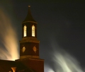
Transcendingby karmatComment: Very cool looking sky. The triangular 'thing'(not sure what it is) in the bottom left corner takes away a bit. |
 Photographer found comment helpful. Photographer found comment helpful. |
| 05/12/2006 08:13:44 AM |
|
| Photographer found comment helpful. |
| 05/12/2006 08:13:07 AM |
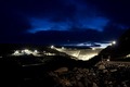
Kárahnjúkadamby biggisComment: The sky looks really nice. I'm not sure I like the rocks exposed so much in the foreground. They draw my eye too much, when I'd rather see the sky and the dam. |
| Photographer found comment helpful. |
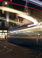
| 05/12/2006 08:11:21 AM |
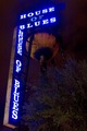
H.O.B.by wmprkgComment: I like the connection between House of Blues and the blue tones. Not the most exciting shot, though. |
| Photographer found comment helpful. |
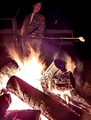
| 05/12/2006 08:10:28 AM |
Roastingby KivetComment: Looks like fun. A little too purple on the color cast. |
| Photographer found comment helpful. |
| 05/12/2006 08:09:26 AM |
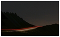
Swoosh No. 9by BeeGeeComment: I like all the various curves. Kind of a spooky shot in some ways. |
| Photographer found comment helpful. |
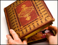
| 05/11/2006 08:55:58 PM |
You can't judge a book by its coverby alexgarciaComment: Nice, clean shot. Fits the cliche perfectly. The Mickey Mouse is subtle, and funny. Well lit, and focused, except for the hands. I would have liked to seem them a little sharper.
Over all great shot!! |
| Photographer found comment helpful. |
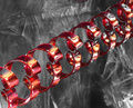
| 05/11/2006 08:53:34 PM |
Rhythmic Curvesby DigiFotoBuddyComment: Very cool photo! I really like the colors and the lighting. And can't argue with fitting the challenge. The only slightly bothersome thing is that parts of the background are a little distracting. Actually, maybe I like it that way... can't decide. It looks good in the foreground part of the image.
Overall I liked this a lot, and can't suggest anything to improve.
So what is it, anyway?? |
| Photographer found comment helpful. |
| 05/11/2006 08:49:22 PM |
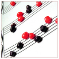
Band Nerdsby RebeccaComment: Creative idea! I like the colors and the composition. Except that part of my mind is waiting for gravity to take over, and for the candies to come tumbling down. The focus could be a little sharper at the top of the photo. I'm not sure I love the border, although I see the point in adding it, since there is so much white in the composition.
over all a very creative and nicely done entry. |
| Photographer found comment helpful. |
| 05/10/2006 05:48:29 PM |
The Gift of Loveby OddfrogComment: from comment trading post:
I like this idea a lot. The names in the forground with the couple in the background works very well.
The names on the boxes could be a little sharper, though. It looks like maybe this is a tad too underexposed. Adding a little more ligt would help. That might help the overall color of the picture, too, which seems a little dark to me. The color is also too yellow, with little contrast.
With some lighting correction this would be a really nice shot. |
| Photographer found comment helpful. |
Home -
Challenges -
Community -
League -
Photos -
Cameras -
Lenses -
Learn -
Help -
Terms of Use -
Privacy -
Top ^
DPChallenge, and website content and design, Copyright © 2001-2025 Challenging Technologies, LLC.
All digital photo copyrights belong to the photographers and may not be used without permission.
Current Server Time: 04/16/2025 11:51:27 PM EDT.