| Image |
Comment |
| 06/23/2005 07:59:42 PM |
Sharpby srdanzComment: Cropping needs work. Too much non-related imagery detracts from the subject. Color looks oversaturated |
 Photographer found comment helpful. Photographer found comment helpful. |
| 06/23/2005 07:58:35 PM |
Metal Boatby hossamComment: Poor photo quality (grid in the sky) and looks washed out. |
| Photographer found comment helpful. |
| 06/23/2005 07:55:20 PM |
Tracksby drz01Comment: Why a 3? Doesn't really seem like a terribly composed photo. You can clearly see trash on the ground, and the framing doesn't tell me what I'm supposed to look at. Too many distracting elements plus the framing make this shot look too much like a random snapshot. |
| Photographer found comment helpful. |
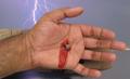
| 06/23/2005 07:53:18 PM |
Metal, that has caused most pain in the History of humanity !by kbhatia1967Comment: I'm not sure what to make of this photo. Overall, it's difficult to believe. The lighting makes the ketchup very obviously ketchup and not blood. The lights on the right side of the waterfront throw the photo out of context with the crucifixion timeframe, and Golgotha was nowhere near water, as far as I'm aware. Maybe if you cropped/edited out the lights, switched to b&w, and gave it some dark shadows, it might be a more believable photo. I know this probably sounds overly critical, but I don't see the point in marking you with a low score but not saying why. |
| Photographer found comment helpful. |
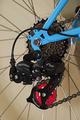
| 06/23/2005 07:31:59 PM |
Mechanical magicby palmfrodurComment: Why a 3? It's just a bicycle part - really doesn't inspire any thought, no matter how well shot. |
| Photographer found comment helpful. |
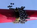
| 06/23/2005 07:29:22 PM |
12-Guage Physicsby swallaceComment: OK, I think I figured out how you did this, and I'm assuming it involves a mirror and 90 degree counter-rotation? Wonderful shot! Really made me think. This is an example of what's great about dpchallenge, photographers inpiring other photographers. |
| Photographer found comment helpful. |
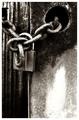
| 06/23/2005 07:04:28 PM |
Deniedby sherComment: I love the harshness of the contrast. It works well with the grainy subject matter. Very striking, overall. |
| Photographer found comment helpful. |
| 06/23/2005 07:03:30 PM |
Convergence in steel by arpitaComment: Absolutely stunning use of color and contrast. I love how the bridge disappears at the other end. |
| Photographer found comment helpful. |
| 06/23/2005 02:23:57 PM |
Cornered and Aloneby mesmerajComment: I didn't find this picture to be "over staged" at all, and certainly didn't find it to look like "stock photography". Would agree with some comments that more shadow would be nice, but the overall effect is great. I would have given it an 8. |
| Photographer found comment helpful. |
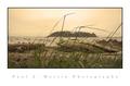
| 06/23/2005 12:40:04 PM |
seastackby papaComment: Absolutely awesome phot. I love... everything about it, but I especially like the tall grasses in the foreground. You've captured this wonderfully. |
| Photographer found comment helpful. |
Home -
Challenges -
Community -
League -
Photos -
Cameras -
Lenses -
Learn -
Help -
Terms of Use -
Privacy -
Top ^
DPChallenge, and website content and design, Copyright © 2001-2025 Challenging Technologies, LLC.
All digital photo copyrights belong to the photographers and may not be used without permission.
Current Server Time: 04/07/2025 10:05:54 PM EDT.