| Image |
Comment |
| 04/26/2005 10:40:26 PM |
The World Is Not Enough!by doctabrezComment: There seem to be two subjects in this, both fuzzy, and minimalism really calls for the eye to be drawn to a distinct subject. The colors are pretty, but the sky is hazy. Increasing contrast a little might have helped. |
 Photographer found comment helpful. Photographer found comment helpful. |
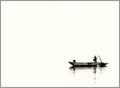
| 04/26/2005 10:39:04 PM |
The Lonely Fishermanby TiberiusComment: An interesting subject, and I like the way the water blends into nothingness. Unfortunately, I really can't stand pure bright backgrounds, since they're very hard on my eyes. |
| Photographer found comment helpful. |
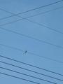
| 04/26/2005 10:37:41 PM |
Bird Songby NyckComment: I understand that you're trying to break up the tedious background with the parallel lines, but the net effect is unfortunately only to distract from the bird, which is so small as to be indistinct.
It was a nice conceptual attempt, but it didn't really work for me. |
| Photographer found comment helpful. |
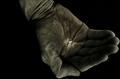
| 04/26/2005 10:36:22 PM |
The Grain Of Riceby SondaComment: I'm not sure how you got the lighting on this, since the grain of rice seems to be emitting light (tagged it with a laser?), but the effect is spectacular. The hand looks almost like it was carved in great detail in stone, and creates an interesting backdrop for an obvious subject. 10. |
| Photographer found comment helpful. |
| 04/26/2005 10:34:44 PM |
keysby frogletComment: Very elegant, minimalist, on a background with an interesting texture. I'm not all that far into scoring yet, but it's the best I've seen so far. The level of brightness is exactly correct, and the older style of the keys makes the subject interesting. |
| Photographer found comment helpful. |
| 04/26/2005 10:32:08 PM |
Switchby philcozzComment: An interesting concept. The fading color of the background offsets the tedium, and the hand in the reflection draws the eye. My only real complaint is that the reflected highlights are distracting and make the reflected hand a little hard to look at. |
| Photographer found comment helpful. |
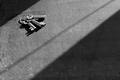
| 04/26/2005 10:30:15 PM |
Snail's Paceby 4scoreComment: My second snail-on-blank shot seen tonight. Yours has the advantage of being on blue, which is less harsh on the eyes and slightly more interesting than white, but has absolutely nothing else of interest, whereas the other one had at least an interesting shadow. There is also a visible halo around the snail, which is distracting. |
| Photographer found comment helpful. |
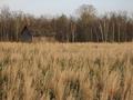
| 04/26/2005 10:28:04 PM |
The Little House...by JEFFJSBComment: Pretty, but ordinary. Nothing really draws the eye to the house, particularly with so much bright vegetation in front of it. |
| Photographer found comment helpful. |
| 04/26/2005 10:24:28 PM |
The Sunby zeke123caComment: Interesting. The colors are excellent, and to my great surprise, having the focus of the picture slightly out of focus, with the focused part used as the backdrop, actually works well for you. |
| Photographer found comment helpful. |
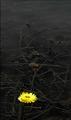
| 04/26/2005 10:22:08 PM |
untitledby amjltComment: Just enough background to keep it from being monotonous, a pretty and interesting subject, and an evocative feel. Unfortunately, the flower seems a little out of focus, and I would have cropped the top a little tighter. |
| Photographer found comment helpful. |
Home -
Challenges -
Community -
League -
Photos -
Cameras -
Lenses -
Learn -
Help -
Terms of Use -
Privacy -
Top ^
DPChallenge, and website content and design, Copyright © 2001-2025 Challenging Technologies, LLC.
All digital photo copyrights belong to the photographers and may not be used without permission.
Current Server Time: 04/07/2025 10:06:25 PM EDT.