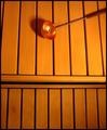
| Image |
Comment |
| 04/26/2005 11:01:59 PM |
|
 Photographer found comment helpful. Photographer found comment helpful. |
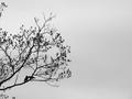
| 04/26/2005 11:01:15 PM |
Want to go back to my place?by ladpupmoeComment: The title and the necking birds make a cute combination. The tree breaks up the monotony without drawing the eye too much or being too distracting, which is good. The overall effect is good, but not really spectacular, though there's nothing technically wrong that I can point to. 8. |
| Photographer found comment helpful. |
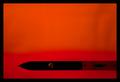
| 04/26/2005 10:59:24 PM |
baselineby zenelfComment: I'm not quite sure what I'm looking at here, or what the object of focus of the image is supposed to be. That entire thing is a knife? What's on the blade?
I do like the way the background is slightly textured to keep it from being tedious. |
| Photographer found comment helpful. |
| 04/26/2005 10:56:26 PM |
Small Duck Big Pondby eostylesComment: Very nice color and reflection in the water. My only nit is that the duck looks slightly plastic somehow. 9. |
| Photographer found comment helpful. |
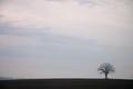
| 04/26/2005 10:55:23 PM |
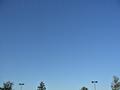
Treeby ColeyComment: The tree is sharp, which is good, but the sky is bright, hard on the eyes, and lacks color. I recommend strongly boosting contrast to bring out the blue. The curved ground is nice, remniscent of a tree on a very, very, very small planet. :) |
| Photographer found comment helpful. |
| 04/26/2005 10:53:19 PM |
Wheels within wheels..by manuraoComment: Nice color and texture on the button, and the texture in the background keeps it from being too tedious. I wish you had chosen a color less bright, though, as looking at all that bright red is hurting my eyes. If you had done this on forest green, it might have been a 9. As it is, 7. |
| Photographer found comment helpful. |
| 04/26/2005 10:51:59 PM |
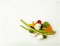
Dinner for Oneby C_Steve_GComment: Simple, elegant, colorful, and the background has just enough texture and shadow to keep it from being monotonous. I find myself vaguely craving a slice of radish, and I don't even like radishes. The noise/grain works well for you, here.
You'll probably get docked for filling over a quarter of the space, but it meets the classic definition of minimalism, if not the contest description, so I'm not docking anything for that. It's not quite as evocative as the best image I've seen so far, against which I'm measuring my 10s, so this gets a 9. |
| Photographer found comment helpful. |
| 04/26/2005 10:49:24 PM |
Standing Strongby beamsclanComment: Eek. Blown highlights all throughout the sky, hurting the eyes and drawing the eye away from the tree into the pure white glare behind it. The wide open space of dull brown sand on the left also fades into some very fuzzy vegetation, which isn't very attractive.
The only positive point is that the colors in the sky on the right are absolutely gorgeous. If you had framed this vertically around the tree, giving it more textured earth below and more dark cloud above, cropping tightly left and right, it would have been much better, avoiding much of the blown white on the left. |
| Photographer found comment helpful. |
| 04/26/2005 10:45:52 PM |
Parking Lotby dahvedComment: I've been scoring negatively for having multiple points of focus, but in this case, it seems to work, as I can see all six objects as a clipping of a single item somehow. I'm not sure *why* it works for me, though. My reasoning seems arbitrary even to me, but it's working in your favor so I guess you won't complain. :)
A couple bonus points for being interesting, but minus one for the slight halos around the trees. 6. The image doesn't really grab me, though, so no higher. |
| Photographer found comment helpful. |
| 04/26/2005 10:42:29 PM |
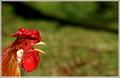
Cock-a-doodle-dooby StructorComment: This is almost comic, and the background fails to be monotonous (which is good, what with all the plain color entries). Color contrast is nice, and the rooster is so sharp and colorful that it actually looks almost like a plastic model. That actually hurts the image a little -- it doesn't look real. Otherwise, the image is excellent. |
| Photographer found comment helpful. |
Home -
Challenges -
Community -
League -
Photos -
Cameras -
Lenses -
Learn -
Help -
Terms of Use -
Privacy -
Top ^
DPChallenge, and website content and design, Copyright © 2001-2025 Challenging Technologies, LLC.
All digital photo copyrights belong to the photographers and may not be used without permission.
Current Server Time: 04/07/2025 10:12:36 PM EDT.