| Author | Thread |
Comments Made During the Challenge  |
|
|
05/03/2005 07:04:22 PM |
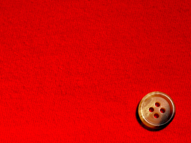
| I would like to see more detail in the background, and the bottom left looks blown out on my monitor. 6 |
|
|
|
05/03/2005 02:45:31 PM |
| Very nice, simple composition. I like that I can see the red through the holes in the button. The red is a little blown out on the lower left. I'm curious if you experimented with different directions for the weave of the fabric. This is not as pleasing as it could be since it's not really diagonal or vertical. |
|
 Photographer found comment helpful. Photographer found comment helpful. |
|
|
05/03/2005 08:59:39 AM |
| it would be nice to get even more texture out of the fabric, maybe if it had higher contrast |
|
| Photographer found comment helpful. |
|
|
05/01/2005 04:50:56 PM |
| I like the textured background. It really goes well with the smooth button. Nice job... |
|
|
|
04/30/2005 05:46:08 PM |
| The red is over saturated and distracts from the button, but nice detail in the button. |
|
|
|
04/29/2005 08:26:38 PM |
| Like the vivid rich red. Nice contrast with the botton. Sharp and good highlights. |
|
|
|
04/29/2005 03:09:27 PM |
| This is a great photo, technically speaking, but I don't find it very interesting. |
|
| Photographer found comment helpful. |
|
|
04/29/2005 02:42:33 PM |
| Perfect for the challenge, 9 for you. |
|
| Photographer found comment helpful. |
|
|
04/29/2005 02:26:37 PM |
| Yep like the use of red and pattern. Plus I think the button has been put in the correct place to give the idea of lines and circles. |
|
| Photographer found comment helpful. |
|
|
04/29/2005 05:55:00 AM |
| While it certainly is minimal, it fails to draw an emotional reaction. Why do I care about the button? Good effort. |
|
| Photographer found comment helpful. |
|
|
04/28/2005 01:21:51 PM |
| Nice idea, i like the contrasting colors between the button and the fabric |
|
|
|
04/27/2005 09:30:53 PM |
| the color makes me squint a little. |
|
|
|
04/27/2005 03:30:45 PM |
| good textures - well done |
|
|
|
04/27/2005 01:11:00 PM |
| Nice. The texture and color of the fabric really enhance the button. |
|
|
|
04/27/2005 12:27:52 PM |
| A button is a nice choice and its placement is nice specially with the dark shade facing the bottom right corner. |
|
| Photographer found comment helpful. |
|
|
04/27/2005 09:25:02 AM |
| I like the colour, but don't feel there's a real point to this image - doesn't grab me |
|
| Photographer found comment helpful. |
|
|
04/26/2005 10:53:19 PM |
| Nice color and texture on the button, and the texture in the background keeps it from being too tedious. I wish you had chosen a color less bright, though, as looking at all that bright red is hurting my eyes. If you had done this on forest green, it might have been a 9. As it is, 7. |
|
| Photographer found comment helpful. |
Home -
Challenges -
Community -
League -
Photos -
Cameras -
Lenses -
Learn -
Help -
Terms of Use -
Privacy -
Top ^
DPChallenge, and website content and design, Copyright © 2001-2025 Challenging Technologies, LLC.
All digital photo copyrights belong to the photographers and may not be used without permission.
Current Server Time: 04/07/2025 01:33:53 AM EDT.