| Image |
Comment |
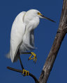
| 11/01/2009 06:42:38 AM |
Little Egretby rrdjservComment: Great capture. I wonder if fiddling with the yellows in the picture could have made them pop a bit more against the white and black in the photo. |
 Photographer found comment helpful. Photographer found comment helpful. |
| 11/01/2009 06:29:58 AM |
|
| Photographer found comment helpful. |
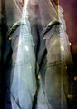
| 11/01/2009 06:22:07 AM |
Halloween Dollby tvsometimeComment: The subject is well photographed, but the car in the background is really distracting. |
| Photographer found comment helpful. |
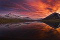
| 11/01/2009 06:20:15 AM |
Fire in the skyby gisliComment: Beautiful colors. The mountain on the right being cut off a bit is a little distracting to me. |
| Photographer found comment helpful. |
| 06/01/2008 10:56:35 AM |
Master of Ceremoniesby JBHaleComment: I really like the lighting in this photo, but the facial expressions of the people in the front row are killing it for me. It seems like they should be excited, but they all look bored. |
| Photographer found comment helpful. |
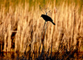
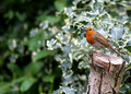
| 06/01/2008 10:40:48 AM |
Sunset Silhouetteby ivale28Comment: I really like the lighting effect of this shot. something that may have helped is cropping it so that the bird takes up more of the frame, and so that the bird is placed in the frame more according to the rule of thirds (instead of slightly above center). |
| Photographer found comment helpful. |
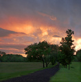
| 06/01/2008 10:36:20 AM |
The Westward Pathby arron_christensenComment: I really like this photo a lot. I like how the path leads the viewer's eye through the picture. Something that may have helped to make it better is cropping out the top 1/4 of the sky (the part that's just gray) so that the sky has more overall color. If you're using Photoshop CS3, adding a little fill light (in raw) to the foreground may also help the picture pop a little more. |
| Photographer found comment helpful. |
| 04/25/2007 09:35:08 PM |
The Third Fallby cools98Comment: This is a superb photo (I really like how the eye is led back and forth between the water in the foreground and background), but it feels like the white balance is incorrect. |
| Photographer found comment helpful. |
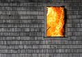
| 04/25/2007 06:08:04 PM |
The Window by ZoomdakComment: This is a superb photo, but it's screaming for a better title. There's such a striking contrast between the very plain, gray siding and the intense chaos inside. |
| Photographer found comment helpful. |
| 04/25/2007 05:10:17 PM |
|
| Photographer found comment helpful. |
Home -
Challenges -
Community -
League -
Photos -
Cameras -
Lenses -
Learn -
Help -
Terms of Use -
Privacy -
Top ^
DPChallenge, and website content and design, Copyright © 2001-2025 Challenging Technologies, LLC.
All digital photo copyrights belong to the photographers and may not be used without permission.
Current Server Time: 04/07/2025 09:05:29 AM EDT.