| Image |
Comment |
| 03/21/2005 11:47:36 AM |
glassesby ceyvalComment: good concept, but you needed to add more enviroment to the shot. Maybe a wood table instead of white, with soft morning light coming in and some coffee. or something that has to do with reading and your light is too flat |
 Photographer found comment helpful. Photographer found comment helpful. |
| 03/21/2005 11:45:50 AM |
|
| Photographer found comment helpful. |
| 03/21/2005 11:43:08 AM |
Morning Gloryby BudComment: It looks like you did a little to much to the color in PS. A poor sunset cannot be fixed to look better in photoshop, however, on camera filters can help. You should give them a try. Also your composition could be helped by not placing the horizon in the middle of your shot. Put it at the 1/3 marks |
| Photographer found comment helpful. |
| 03/21/2005 11:39:44 AM |
My hands are tiedby MontereykiddoComment: I am not a big fan of selective color and I think you color is to saturated, but I really like your concept. |
| Photographer found comment helpful. |
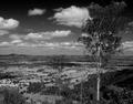
| 03/19/2005 11:48:44 AM |
Rural Countrysideby HeavyComment: Critique Club
Heavy, i think that you nailed the tones that Ansel Adams had in his photos. however I think that you are lacking his eye for the landscape scene. While you picture is very nice, I think it could be improved. The sky is the most fasinating part of the picture, the land is a bit boring to me. And your perspective is at eye level which can take away from the scene. Everyone is so used to seeing at this angle that when new angles are introduced through photographs it becomes more intesting to the eye. Your photo is also split down the middle with the horizon right at the center. I would have like to see you shoot from ground level and have the horizon in the bottom thrid of your photograph. This would not only make your tree feel larger than life, but it would give you more of the dramatic sky. I like that you place the tree off centered. Overall, I think you did a good job, when you go out make sure you shoot from different angles and try to keep your horizon out of the center. Good job on tones! |
| Photographer found comment helpful. |
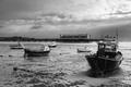
| 03/17/2005 07:09:38 PM |
Low Tideby floydComment: Critique Club
Wow great shot, one of the better in the challenge. Your tones are GREAT, you nailed that. I am jelous that you had a chance to photograph this and that there is nothing like this where I like, anyhow good eye. The only think I could suggest that may improve this shot is cropping out some of the sky. I think it is more dramatic to place horizons either in the top third or bottom third. In your case it would have to be the top third. I think that by placing it in the middle you are splitting the picture in two. Especially with the dominat pier in the back. By decreasing the amount of sky it should help draw the eye to the boats. Great job and keep up the good work |
| Photographer found comment helpful. |
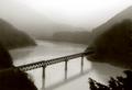
| 03/17/2005 09:08:11 AM |
Railway Bridgeby shutterphunkComment: Critique Club
Very Beautiful! I took a long look and read all the comments. I do have to agree that the tone of your picture is not AA, but I think that if you prefer the sepia better, than it is ok to introduce some of your style to the challenge. I think you do an excellent job getting a large amount of tonal range. I don't love the tree in the bottom right corner, however it does stop the eye from following the river right out of the picture. I also would have like to see the water just slightly brighter and compare the too. I think with the water lighter (just a little) that the photo would "pop" a little more. Try it and see which you like better. Overall, I think you did a fabulous job of meeting the challenge and the quality is wonderful. Good job! |
| Photographer found comment helpful. |
| 03/17/2005 08:59:59 AM |
Leavesby ladpupmoeComment: Critique Club
I really love the tonal range you have here and I love the contrast! I would have liked to see the black background cleaned up a bit, pre photo of course. The white spots are distracting. I think it would have been great to see all of the leaves be the same and closer in. All leaves and no background at all would also be a good thing to try. With the quailty of the light and your tonal range even just cropping in a bit would make it more interesting. Good job, I think you nailed th ansel adams lighting and tones. |
| Photographer found comment helpful. |
| 03/17/2005 06:03:04 AM |
Renewal of the Soulby NusbaumComment: everything about this photo I just love, the light, her expression, posing, everything! I is one of my favorites!! |
| Photographer found comment helpful. |
| 03/16/2005 08:10:09 AM |
|
| Photographer found comment helpful. |
Home -
Challenges -
Community -
League -
Photos -
Cameras -
Lenses -
Learn -
Help -
Terms of Use -
Privacy -
Top ^
DPChallenge, and website content and design, Copyright © 2001-2025 Challenging Technologies, LLC.
All digital photo copyrights belong to the photographers and may not be used without permission.
Current Server Time: 04/07/2025 09:55:25 PM EDT.